Font Review Journal

After attending Typographics this year and having some awesome conversations with some of my type design icons an idea hit me: we need more discourse and analysis around the usages of typefaces by designers, for designers. So, I'm going to start the Font Review Journal, where I will be talking about the general aesthetics and historic influences of typefaces while spotlighting unique letterforms or characters and breaking down what a font excels at and what it has a harder time with.
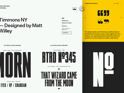
I'm starting with Timmons NY as my first case study as I design out how I want the pages to be laid out, and because it's me the design has a zillion typefaces at the moment. I'm really stoked to be using Untitled Sans and Styrene!
This is the sort of project I have a hard time figuring out how to showcase on dribbble but I'll try to keep you all posted on how it's going and hopefully it'll be online before too long.