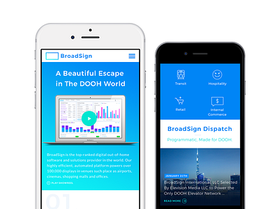
Broadsign Interface Mobile Website

The new identity needed to encompass the full spectrum of Broadsign’s communication tools: stationery, a responsive website, social media / recruiting posts, HR tools, and the tone with which they communicated with both their employees and their clients.
We began by refreshing their logo, replacing their old triangle “play” device with a minimalist frame that was less limiting as a visual symbol, since Broadsign had evolved from selling “Player Devices”, and moved forward into a new era of web software. The new logo places the company at the center of their industry.
To remain approachable, shades of blue were combined with engaging copywriting, a friendly sans-serif typeface, touches of graphic devices such as underlines, vibrant secondary colours, playful patterns used in moderation, and plenty of white space. This toolbox could be easily rolled out and adapted to their wide range of communication tools.