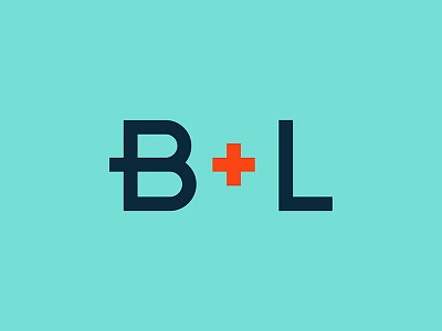
B+L Abbreviated Logo

I had the chance to re-design the brand identity for Boelter + Lincoln in collaboration with our creative team. Our identity seemed too masculine for who we were, especially being a woman-owned agency. I think we are all happy to ditch Abe and come up with a new look, along with a fresh color palette.
The plus is a big symbol of who we are. It's obviously a symbol of "and" in our name. When a client asks if we can do something we always answer with a "Yes. And..." mindset, as we are an extension of the client's team, adding value where needed most.
After coming up with the mark, I wanted to design some custom typography for the logotype. I thought it made sense to bring that plus back into the B, aligning vertically with the plus in the name to bring it all together.
