


005—App Icon

005: App Icon
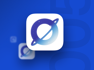
Today's goal was to design an app icon. I decided to continue to explore the identity for SOAR, which is a space-oriented club at my college. Icons are incredibly challenging to get right, due to how they scale, and their (generally) small size. I wanted to bring the exciting feel of "space" into this, and the idea that the app is transporting you into being a part of that vision.
Today's Reflection:
Wow, app icon design is tough. Making something that's visually interesting, clear, and scales is tough. I definitely have a greater respect for those who specialize in this! I'm pretty happy with how this came out, but I think the style could be more refined or simplified later on. I know gradients and skeuomorphic stars don't tend to age well. Right now it fits with how I'm imaging the brand to feel throughout its applications.
Good:
• Works well enough when scaled.
• Visually interesting
• Nice colors
Room for Improvement:
• Could manually adjust each size for finer control