Payment Screen

As a part of the Daily UI challenge, The second UI was that of a payment screen.
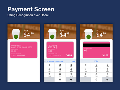
While the solution presented breaks the usually used 1 screen layout for filling it credit card information, it solves one of the major problems with credit card screens. The problem of recall. There's little mapping with the real world, and users are often left looking for entries on their credit card, and double checking them.
This UI makes use of 2 Heuristics to overcome the problems.
1. World in Miniature mapping.
The credit card on screen has the same spacing and spatial arrangement as that of a physical credit card. Making it easier to locate card number and security number for first timers.
2. This in turn facilitates the second heuristic of Recognition over Recall. You don't have to memorise or double check numbers with this layout.
---
This UI was presented as a part of the daily UI challenge. The design brief ignores the use of more modern tech like Apple Pay.
#dailyUI #002