


Opportunity | Exploration


Hi Everyone!
Today I saw some job finder app in my free time for inspiration and solving problem too. so I did this exploration and I wanted to keep it as simple as possible and few solid usability fixes ;)
Some core things... what is the thoughts behind this exploration.....
1 - At first after installing the app in process system will ask you about to select your skills filed/categories. so that the home page will be following the filed/categories you selected.
you can edit them if you want to change by clicking "Me" bottom button ( and this "me" button has more necessary features )
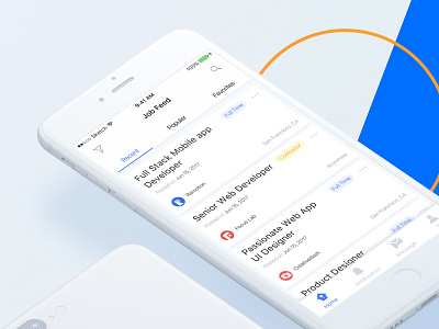
2 - In the home page you see nab bar has some menu so that you can see recent job, popular job, your favourite job....... (dummy text) also if you want to see more specifically you can use the filter button in top right corner
3 - in top right corner you can see the search button it helps you to find out a quick result what you are looking for
4 - Now let's talk about bottom bar, it has four important buttons and they are in easier location or in thumb’s natural radius zone....... ;) so that user can easily navigate them... also I am thinking to update this shot again with more better solution if possible.
I hope you guys like this shot and please feel free to share your opinion :)
MY LATEST WORK