


World surface temperature analysis

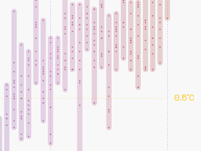
I started to play with a dataset from NASA about the global surface temperature change. The data shows surface temperature changes from 1880 to 2016.
In this visualisation, every vertical line is a year and every dot is a month. The temperature is plotted on the y-axis.