Responsive design in Sketch
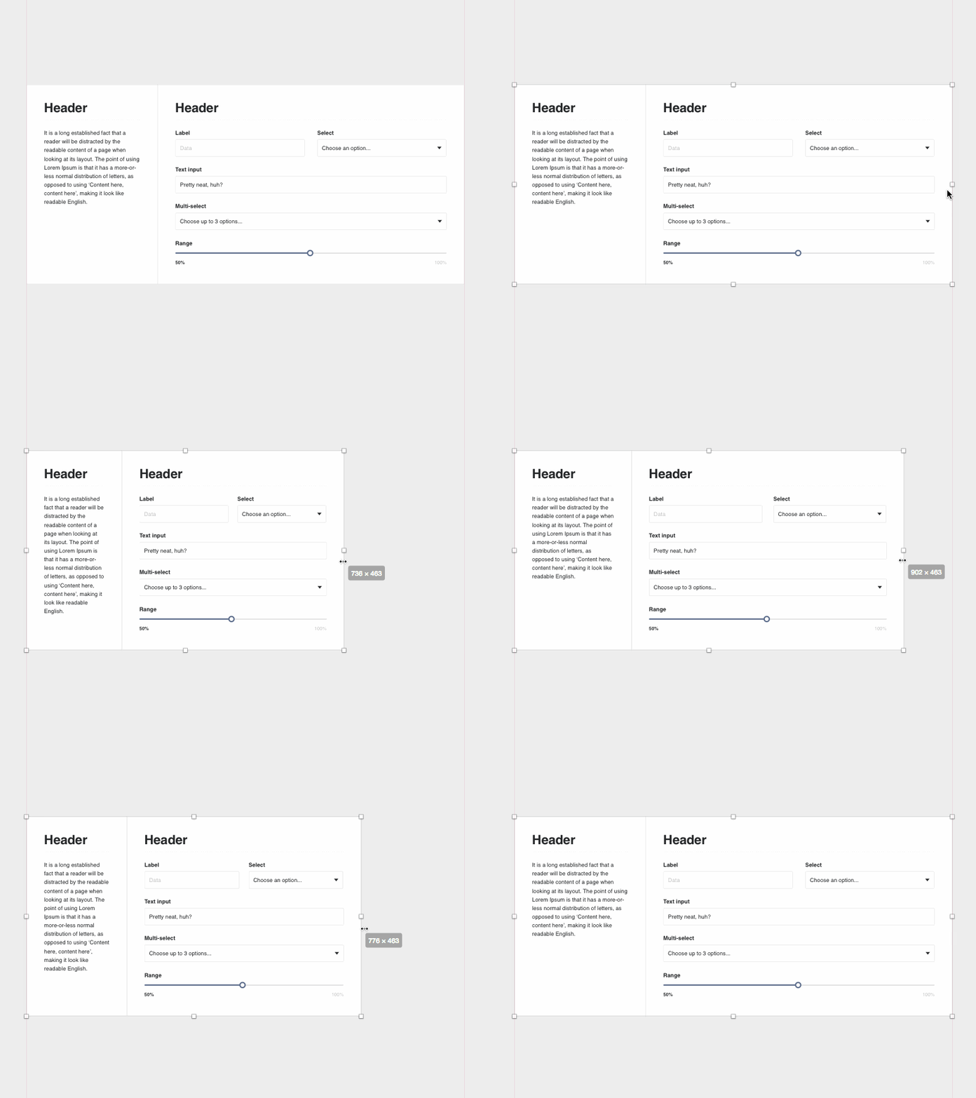
While it’s simple to build responsive components, it’s not so simple to mockup responsively. It’s important to design web UIs that work at different browser widths. Fortunately, Sketch provides the ability to set elements to respond in different ways as they grow or shrink in size. Using a combination of settings, groups and symbols, you can create a basic responsive UI in Sketch. While this won’t help you with breakpoints, it is powerful for quickly seeing how or if the design works at different browser sizes. Thus we created our new design system library to be responsive. Read the full case study here >
View all tags
Posted on
Jan 31, 2017
More by Andrew Couldwell View profile
Like

