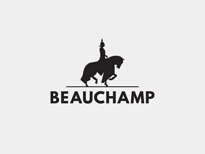
"Beauchamp" Logo
The "Bauchamp" company logo had a firm direction from the start. The logo had to give off a strong, noble and reserved atmosphere while still having a modern appeal.
The icon features a fully armored knight with two diagonal legs raised to distance the logo of any connotation with the Gettysburg equestrian statue regulations.
The typeface chosen was League Spartan for its bold appeal and the bowl differences in the uppercase "B" as well as the slanted terminal end on the "C" that complemented the odd angles of the icon.
League Spartan also works well with Libre Baskerville, which was one of the prerequisites. The thin divider also serves to this effect.
Hope you like it.
View all tags
Posted on
Jan 25, 2017
More by Nemanja Bogdanov View profile
Like

