Empty States

Hello dribblers,
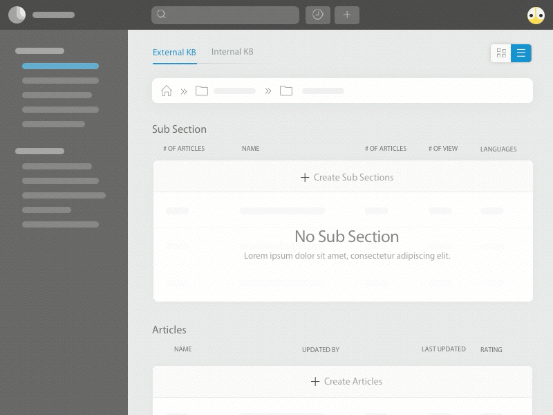
I am super excited to share animation done for KB feature in our support product. Inside KB, we have two section (External KB & Internal KB). User can quickly switch between section using tabs.
The most basic empty state displays a non-interactive image and a text tagline and I'm bored of it. Thought to create a minimalistic UI (imagining to remove the feel of empty page + to avoid creating a lot of illustration which eventually increase app load size).
Main reason to place create button inside the list or card view to reduce clutter in the UI, also it is obvious that the content they create will come inside that particular section.
Feedback & comments are most welcome :)