Spotify Redesign

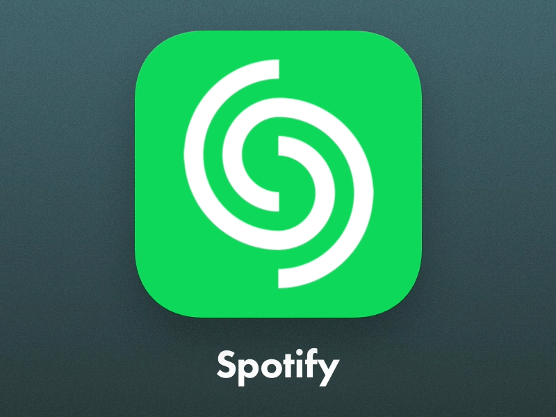


Day 5 of the daily UI is "App Icon". Sure... maybe i kinda got carried away and animated an icon. Maybe in the year 2020 apple will make icons animate, so don't judge.
Not sure about you but I feel like the Spotify logo is really outdated... they updatd the color but the mark always bothered me, so this is my take at it. This is just a CONCEPT.
1) Can you see the letter "S" in the center?
2) Sound waves radiating out.
3) Spinning vinyl record resembles music.
4) Matches the Fibonacci GOLDEN RAITIO
Feel free to leave your thoughts and share this is you think its cool.