Royal Knives Logo Rebrand
Royal Knives Website: https://royalknives.co.uk/
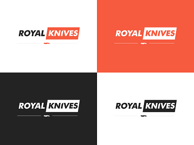
Royal Knives are a company that sell real CS:GO knives worldwide. I look at the companies logo and thought I could be a lot better. I wanted to make a clean and stylish rebrand for them, something with a eye catching colour and a clean type face.
I wanted to incorporate a knife silhouette like their logo they use. I felt a Krambit Knife has a strange curved shape to it and wanted to go with more of a straight knife for the rebrand. The knife I used was a Gut Knife, Royal Knives do sell Gut Knifes and that was another incentive to use a Gut Knife silhouette.
A thing that I really like in logo designs is when the designer uses the type face to show a hidden element either using negative space or reshaping the type face to show a hidden element. I had a idea of curving off the top left side of the 'I' to make the 'I' look more like a the blade of a knife.
Any feedback in appreciate and don't forget to drop a like! :)


