S+G

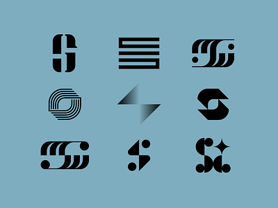
Several logo concepts for a client combining a "S" and "G" in an elemental feeling way. As designers we all know the classic tale of our least favorite concept being approved as the final. Can you guess which concept was approved?
Personally, my favorite is the top left. I felt good about achieving the concept I was going for. Sometimes it looks like a "S" and then you look at it again and it looks like a "G" and on and on.