Menu transition for Slush.org
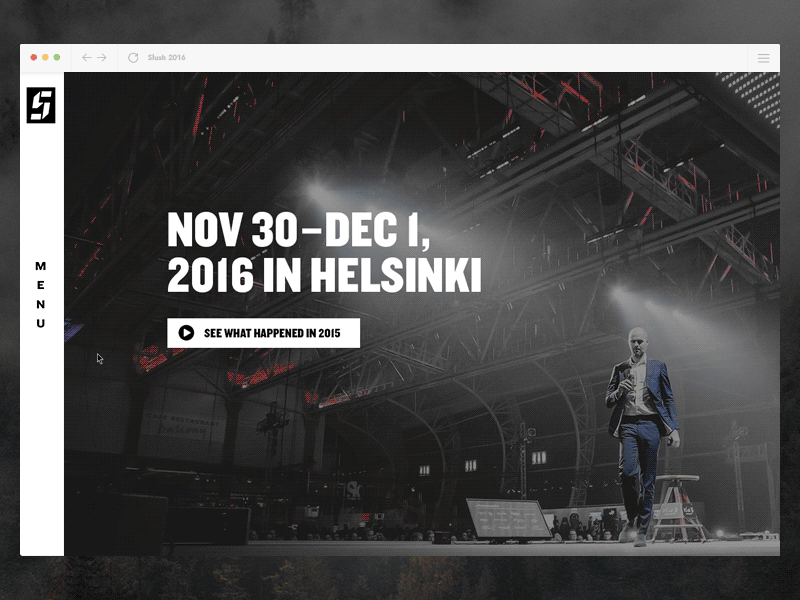
Since Slush is described by many as “Burning Man meets TED”, we wanted to do things a bit differently on our new website too. One of the things I’m most proud of, is our navigation that smoothly slides in from the left side and lets you explore the content. Instead of the traditional burger menu we ended up having multiple burgers! How awesome is that?
In this prototype we have search, some main headlines, login, a highlight area and our social media channels. The content has been changing through the year and is also changing in the upcoming weeks as we are going to publish something cool that lets you explore more content now that the event is over. This solution is also quite flexible as we have other events around the globe and they need to have their own versions too.
You can see the menu in action at www.slush.org
The website is done in collaboration with our partner Evermade. Huge amount of respect especially for Mikael Toivio who is the wizard who made the site work so smoothly.
Photo on the background is taken by Jussi Ratilainen.