Sorenson Elite Athletics

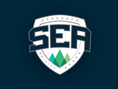
A friend of mine started his own sports strength and conditioning program and I decided he needed a good, strong, athletic-looking logo to get him going. He started Sorenson Elite Athletics while in the Pacific Northwest, enjoyed the outdoors, and loved the Seahawks colors, so I developed an identity based off all that.
First, I thought shortening the name to SEA made for a more impactful logo (he'd taken to doing that online sometimes, anyway, as #SEA). I gathered together three trees at the bottom to represent the core of his training -- strength, agility, and speed -- and specifically called those out around the edges of the shield. And finally I went with a deep navy as my primary color, with pops of bright greens (a la the Seahawks) and I was done.
Since I recently had some free time I decided to take another pass at this in hopes I could improve upon the design with some fresh eyes. That kinda thing tends to happen a lot around here...