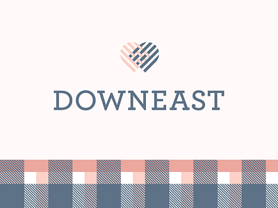
Downeast Logo Option 2 (unused)


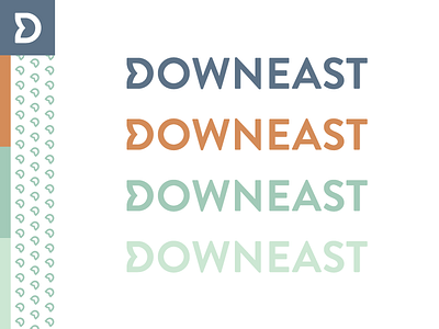

Second option for Downeast. This is a simpler solution, typeset in Brandon Grotesque, with a tweak to the initial letter to create a tulip/arrow shape. I thought this provided a strong sense of forward momentum and energy through the logotype and created a nice masculine/feminine balance.
See attached for hang tag concepts.