Omnia font

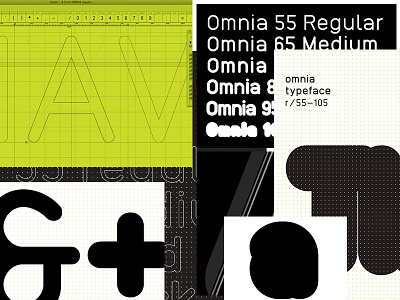
Omnia is built under a mechanical grid constituted by a series of vertical, horizontal, slanted and 45º degree curvilinear modules. This process provided me a deep understanding on type as a singular element, a singular glyph or, even, as a full set of characters.
Omnia is a type family consisting of six weights and two main spacing variables. It is a logical type structure in which the spacing decreases systematically according to its weight grown, resulting into the concentration of the text bulk. Hence, this type system creates a relation between three parameters: stroke modulation, spacing and scale.
This parameters ratio makes Omnia's lighter weights more appropriate for extensive text purposes and heavier weights more suitable for large scale use, like magazine headlines.
The spacing varies from a uniform set in the 55 regular weight and a tick hairline spacing presented in the 95 heavy weight. Consequently, the tracking and kerning of the 65 medium, 75 bold and 85 black weights are adjusted in order to make the bridge between those two opposite weighs.
More info:
https://www.behance.net/gallery/7342919/Omnia-typeface
http://lccpgdesign.com/2011/content/students/joo-costa/projects/omnia-typeface