fOxygenic Icon


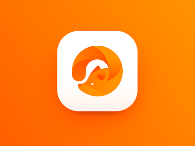
Hi buddies! New shot is ready so I hurry to share it with you! This time I'd like to show a piece of my practice on graphic design for branding purpose which is the concept of the icon. It features a logo for fOxygenic, a mobile application which represents a social network for people loving active life, open air sports and events. As you see, the mascot is combined with the shape of “O” letter. Bright warm color shades reflect not only the traditional vision of a fox coloring, but also the idea of dynamic life, joy and great mood. Moreover, the color has high visibility potential which strengthens the icon's recognizability. Hope, it will make you day a bit brighter as well!
Here in Tubik Studio we have learned through everyday practice of design projects that design is not pure creativity but making the product for users where every icon, illustration and element should be stylish, recognizable and purposeful. Follow the updates in Tubik Blog sharing practical tips on diverse design issues. Have a dynamic day!