


How its made - a splash of user flow


In the age of rapid prototyping and digital mockups we can often speed up the process of website or app dev by skipping full comps or wireframes, but we always start with the user and mapping out their flow.
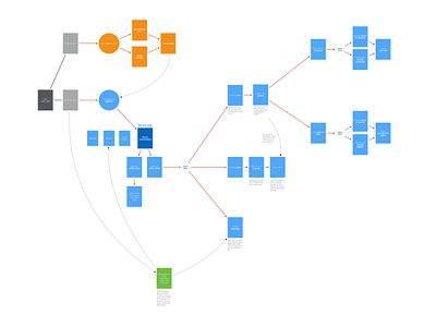
We use different block colors to separate experiences within the flow, descriptions below any that aren't obvious, then hard strait arrows for direct paths and curved dotted lines for variable paths.
---
At Colauncher we bring experience from our time at highly structured Fortune 500's to quick, nimble startups and nonprofits