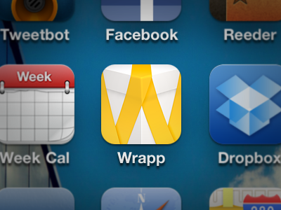
Wrapp iOS Icon Tweak

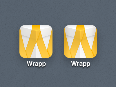
Trying a small tweak as per a suggestion made by Andrew Crookston: some added shadows at the edges of the Wrapp iOS icon. I got reminded of this after seeing the nice improvement of the Instagram 2.0 icon, and I thought some added depth would work well in the Wrapp icon.
Current icon to the left, tweak to the right.