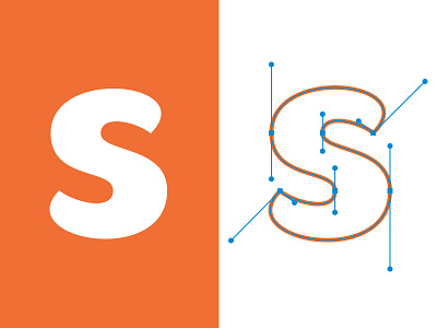
"a" vector process

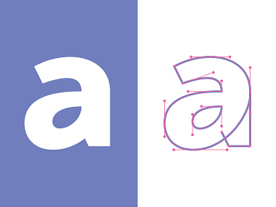


I like to create from the ground up all the letters that make up the logotypes I design. Most of them anyway.
Today I was enjoying creating an 'a' which is one of the most challenging letters as you have to squeeze in a heap of curves in a small space and somehow keep it all balanced. It's very easy for things to go pair shaped so I thought I'd share my process with a snapshot of my anchor points and nodes.