Reuters News Pro - Icon Suggestions

Reuters hasn't asked (or hired) me to do this, but as I'm a fan of their News Pro iPad app (warning: iTunes link), I thought I'd put it here for them to find and (hopefully) use.
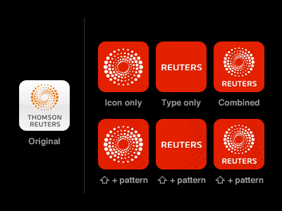
The current icon is the same as their other apps, and feels completely off-brand when compared to the UI of the app (even if the colors are on-brand for Thomson Reuters itself).
To remove the disconnect, I simply remixed existing elements used in the app's design — any of the options are an improvement over the existing icon, and I've even tossed in the default Apple gloss for comparison (wait for the animation :), though I usually prefer icons without it.
Reuters: if you're listening, I'll gladly let you use any of these — just drop me a line.
UPDATE: It seems HUGE is responsible for the lovely app design, and I'd be willing to share this with them, too :)