


Keybar

Early work in progress. It's a key-bar component, adding a row of user-customisable keys on top of the regular on-screen keyboard on iOS. For use in third party apps, of course.
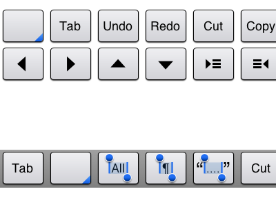
The customisation interface consists of a set of keys (above) and a bar to drag them onto (below). Keys can be dragged around on the bar, or dragged off to remove them. Some keys have predefined functions, like Tab, and some have behaviour the user can choose (inserting text, whether to wrap or replace the current selection, etc).
The bar background and general customisation UI are very early stage and just placeholders, but there are two visual issues I'm playing with:
1. How to indicate that a key on the bar is customisable. Currently, it's the blue corner in the bottom-right. I've tried a dot (too similar to the selection keys), an ellipsis (looks bizarre when there's also text on the button itself), and a thicker border (looks unbalanced/embossed compared to the other keys). It's just a visual convention to use in the customisation UI, but I'm not yet happy with it.
2. The selection keys, shown in the bar at the bottom, after "Tab" and the blank/customisable key. From left to right, they're: Select All, Select Paragraph, and Balance Quotes (i.e. select outwards from the insertion point, or expand the selection, to just inside the nearest containing set of quotation marks). I was searching for a way to convey selection visually without using wordy labels like "Select Paragraph", and the iOS selection-delimiters were an obvious possibility. I just wonder whether they look too "live", like the keys themselves are being edited. I wonder if they could perhaps do with a simplifying, flattening treatment - to still show the same thing, but in a more conceptual, diagrammatic way that seems less editable.
Just offered for interest. I'll be sure to post again as the concept evolves.