Instagram - 2016 Redesign

Thought this particularly relevant now, as Instagram decided to redesign their iconic app icon, with a garish rebrand that is completely inconsistent with their Brand Messaging. The UI of the new app is devoid of Brand Continuity and destroys the intuitive and subliminal messaging that you are using Instagram.
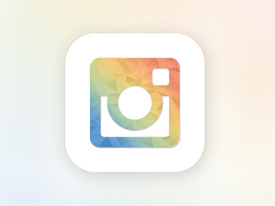
The app icon you see above, is something that I spent around an hour on last October, when Instagram released Boomerang, Hyperlapse and Layout. It seemed that the Brand team at Instagram has a very logical and intelligent rebranding path. With my icon following the same design language. But somewhere along the way they lost direction and have stumbled down a different path altogether, a path that has led to drastic rebranding that is inconsistent with the Brand's Corporate Communication pattern.