QUBE logo v2 (scaled)

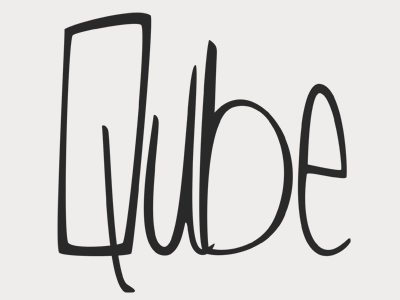
Rebranding what we currently have.
Looking to implement aesthetics borrowed from the arbutus tree in v1 to the logo and give the whole thing a more organic tone and feel.
Thinking:
- laid back
- west coast
- grounded
Not sure whether we're gonna go for a strict logo-mark as well, or just stick with this for the brand.
Things that need work:
- tail of the Q and U
- spacing
- cleaning up the edges
Feedback is greatly appreciated!