


Nimble - Sketches


I've been getting a good response sharing my process recently and so here is something i'm working on now for a concept logotype
Thoughts on Process:
1. I wanted to make this piece look 'nimble' and so decided to look into the word rather than the brand behind it on this occasion as it's a personal project.
2. So after looking into the word i decided on creating with 'A Fast, Flow of Movement,' in mind to influence styles and elements of the lettering.
3. I can up with 6 directions which I would then show a client with some explanation which you can see here. Let me know what favourite is!
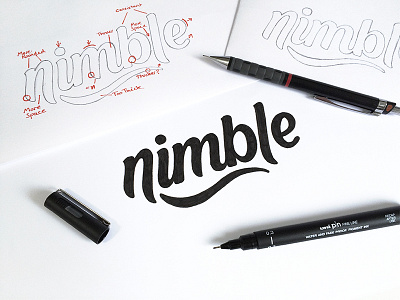
I made the decision based on the goal to take No.1 forwards and starting to refine the sketch using my light pad. Once I had a more accurate sketch I started to label it highlighting areas to improve and also consistencies to be aware of which you can see here
The final sketch was then formed by tracing and making the necessary adjustments based on the labelled version.
Points on Final Sketch:
1. The ‘E’ needs a lot of work as it’s the letter I always struggle with!
2. The negative space in the ’B” is maybe too much?
3. The ‘E’ needs bringing closer to the ‘L’
Please let me know your thoughts and If you want me to keep making these type of posts?