Home Monitoring Dashboard

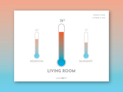
Not sure how I feel about this one. The colors are supposed to be representation of hot and cold but it feels a little forced. What do you guys think?
Not sure how I feel about this one. The colors are supposed to be representation of hot and cold but it feels a little forced. What do you guys think?