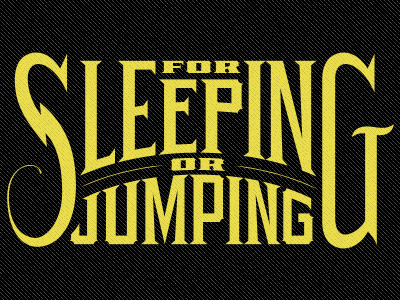
Lettering on a curve
I've attached a file if anyone wants a closer look. The curves of the arch are divided with the glyphs and overlap is deleted. "For" and "Or" are given the same lettering treatments. Finalizing tweaks are made: The "M" and "N's" are adjusted for optical corrections where the meeting of stokes made the letters weighted to heavy. Access nodes created from the divide filter are deleted. There are still some technical issues I see with the "S" "P" and "G", but I like that they aren't perfect and still retain the charm from the original pencils. Sometimes you've gotta let the nails show.
This is my first attempt at showing my process or doing a mini tutorial. Let me know your thoughts and if you have any questions/comments about the project.
View all tags
Posted on
Sep 9, 2011
More by Alex Sheldon View profile
Like


