The West Hill School Identity Creation
Identity and brand development for The West Hill School, a very exclusive, high-end private preschool in the suburbs of Philadelphia.
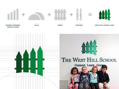
The West Hill School symbol is constructed from many things. The negative space below the symbol is a fun play on the word "west hill" located in the name of the school. A fence was incorporated with 4 pillars, representing the four words in the name of the school. The pillars themselves are in the shapes of crayons, which is the writing utensil the children at the school use the most. And finally, the pillars and crayons ascending in height represents an upward trending growth chart, which visually shows the physical, mental, and emotional growth the children receive during their time at the school.
The color green has been associated with The West Hill School since its inception in 1973. We wanted to continue using green to have some of the brand recognition applied to the new logo. The same thing applies to the typeface, as they have always used a serif typeface with small caps.

