Foursixsix Branding

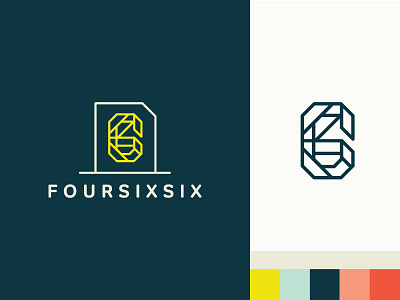
The final brand marks I designed for illustration studio Foursixsix, run by @Carlos Basabe.
This was a tough project because I'm so close to the client (you know, like, married to him). We made this a very collaborative process and worked together in the concept and sketch phase, going through more concepts and ideas than I can count. We even took another concept almost to completion, before realizing it just wasn't right and scrapping it to start over. We landed here with a semi-abstract symbol that still represents the name upon closer observation. The container is a bit reminiscent of the "document" symbol, which we liked because it reminds us of a plain piece of paper ready to be doodled, drawn, painted or scribbled on.
The type is Tondo Bold, which fit perfectly with the monoweight lines and rounded end caps of the symbol.
Check out foursixsix.com to see it in action.