Frederick And Company Licensed Insolvency Trustee

This was a fun challenge. How the hell does one create a logo for a company that helps people out of bankruptcy? Everyone else in this industry defaults to your typical lawyer like logos - initials, gavels, scales, pillars, etc.
After talking with Rebecca, I knew that she was far from a typical lawyer like business. She was a warm woman who truly wanted to help people out of their financial difficulties. Her approach was not cold and corporate. So naturally she needed an image that expressed her company's approach but at the same time, expressed that her company was professional and credible.
She had a fantastic tagline already created "from financial distress to financial success™". She essentially took the weight off her client's shoulders and allowed them to be free from the financial burden.
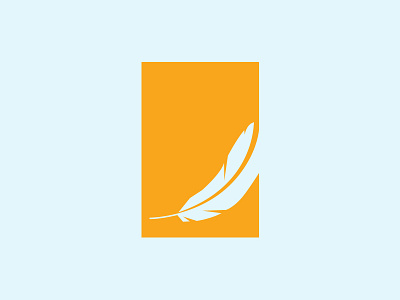
I wanted to create a logo that expressed the action of taking flight. When a bird leaves the ground it is natural for a feather or two to be left behind. I wanted her clients to feel the same emotion.
The lone feather gently floating to the ground and freeze-framed in a positive upward motion - along with the gradual curve upwards to signify financial gain - became the solution to her company's image.