Headspace Redesign

This was part of a week long design challenge. What do you think?
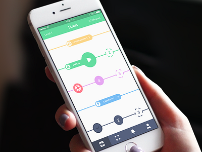
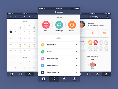
I have redesigned the main navigation, tab bar, to include the following: Timeline, Discover, Schedule, and Profile. The timeline is now focused on playing multiple meditations and allowing the user to see their meditation journey visually. (https://dribbble.com/shots/2564366-Timeline) Discover is now the only place where users will go to find all content available to them. Schedule now allows the user to set meditation days and times and track the days when they completed or missed a meditation. Profile is where the user will go to see their progress, buddies, activity, and access settings. These changes give each screen unique and precise functionality which allows the user to navigate quickly to exactly what they are looking for.
I believe app usage will increase due to these updates in design, ease of use, flow, navigation, and functionality. Users are now more likely to meditate more and on a recurring basis with the added functionality and dedicated screen for scheduling. In addition to meditating more often they can now choose multiple areas of interest and do not have to wait or lose their current position in a series.
---
Like? Press "L" | Zoom? Press "Z"