Logo throwdown

Okay dribbble, need your vote.
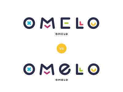
This logo is for a product I’m working on (demo.omelo.com). The vibe is “fun meets professional”. We’ve been torn between which “e” works best - there shouldn’t be any character ambiguity, nor should it be too playful that it loses professionalism.
What would be your pick?
Thanks!