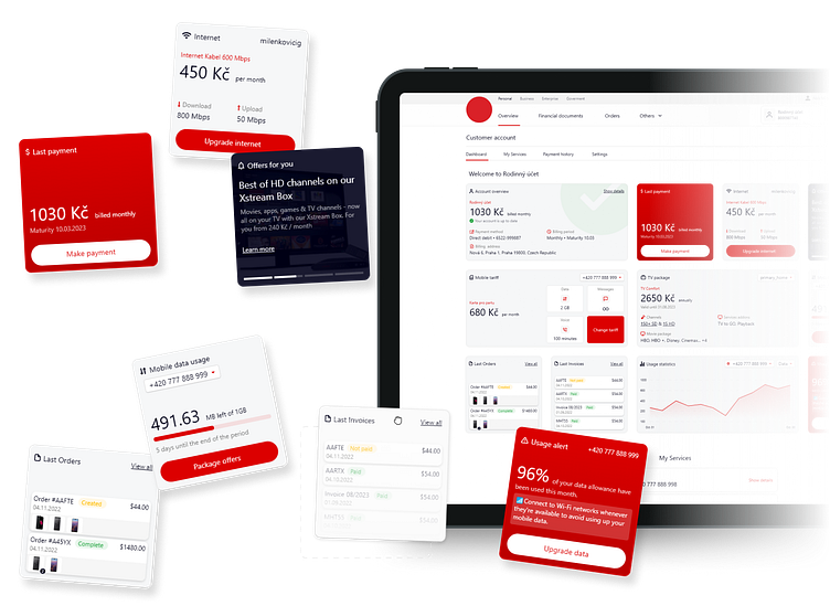
Customer Account Dashboard as part of eCare
The original customer account dashboard was cluttered and challenging to navigate
Users faced difficulty locating essential information, such as account details, payment information 💳, and tariff plans, due to the lack of organization and clear structure.
Solution
To categorize and divide the information into separate sections, which improved user interaction and accessibility.
The redesign significantly improved the user experience by organizing the account dashboard into a more intuitive and navigable interface. Special offers and promotions for specific services were highlighted with banners, and the addition of active addons for specific tariffs with toggle options for activation/deactivation provided users with greater control over their services.
The Customer Account page was further refined into four distinct tabs:
• Dashboard (with widgets)
• My Services
• Payment History
• Settings
New customer dashboard was customized to offer a personal touch ✨, displaying relevant widgets such as recent payments, special offers, data usage stats, and latest invoices

