Icon for resort company

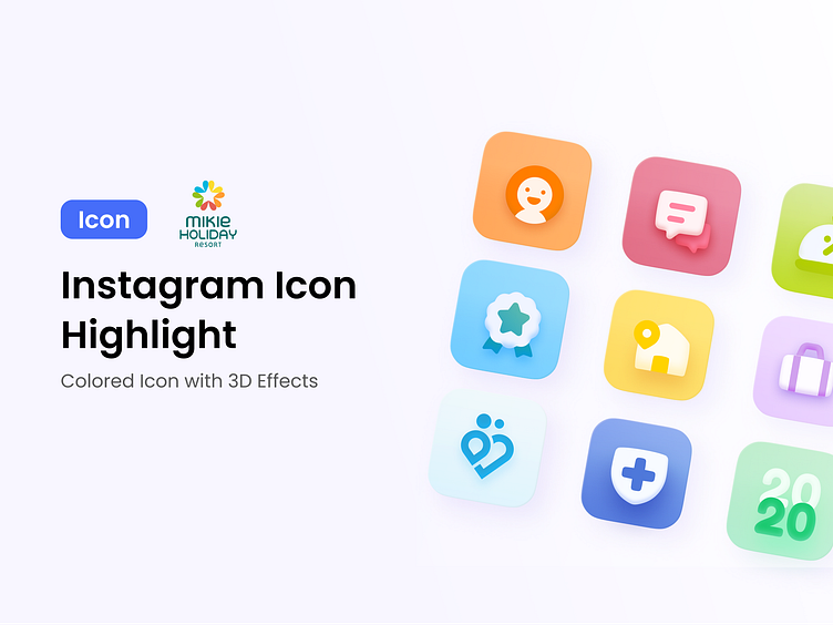
In 2020, during the COVID pandemic, the hotel company Mikie Holiday planned to change the design of their icon. They wanted a design that would emphasize a holiday atmosphere, happiness, and a family- and child-friendly vibe.
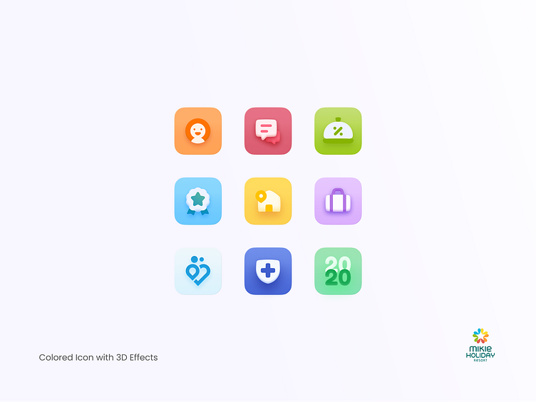
Based on this brief, I redesigned the icon from its previous flat style with primary colors to a fresher look with brighter, yet still light, colors. I also added a slight shadow effect to the icon to give it a 3D impression.