Superdrug Refresh - App Concept


What if we gave the Superdrug app a little refresh? Upon its review, I noticed some inconsistencies in typographic hierarchy and colour usage. Related features felt disjointed and spacing the overall information didn’t appear clear. This prompted me to consider several points:
💄 Why is the welcome message in the centre?
💄 Why does the Beauty Card feel hidden?
💄 Why are upcoming rewards concealed?
💄 Why can't I add to Apple Wallet?
The app currently feels disconnected from the Superdrug website and brand. With these thoughts in mind, I embarked on a conceptual redesign using the original colours, fonts and the current app tab bar.

Home Screen Section
🫦 Made the Beauty Card more prominent and visually obvious.
🫦 Simplified the design for a fresher look.
🫦 Updated the progress sections to a circular fill, placing them next to each other to relate spending, points and VIP status.
🫦 Revealing the next reward so you know what you’re going to receive if you spend.
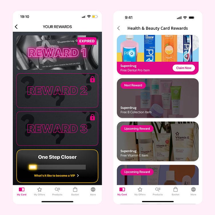
Rewards Section
🫦 Made unlocked, next and upcoming rewards visible.
🫦 Included titles of what you will receive.
🫦 Created a clear distinction between what is locked and unlocked.
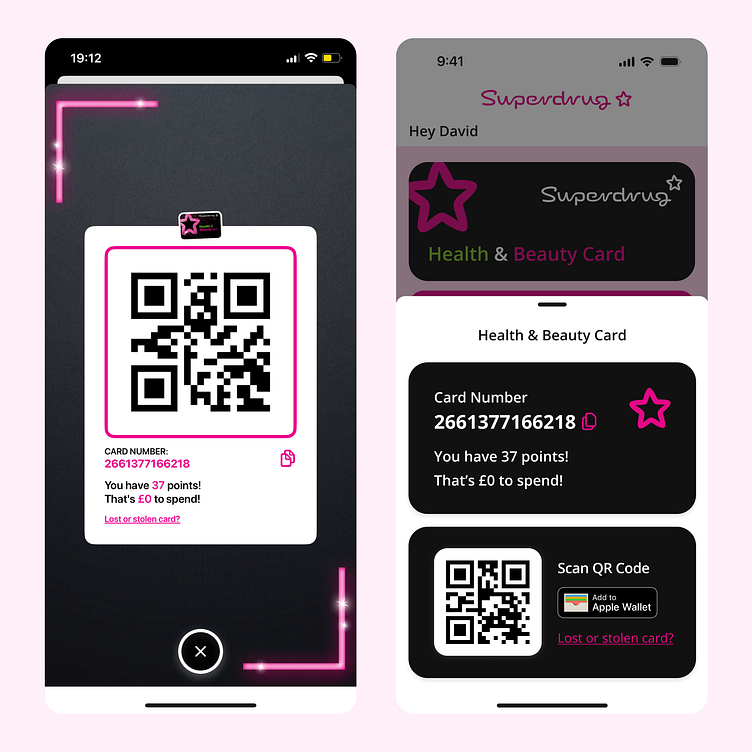
QR Code Section
🫦 Simplified the design for clearer visual appeal.
🫦 Added an option to integrate with Apple Wallet for offline access.
🫦 Moved the copy icon next to the card number.
🫦 Made the text larger for accessibility purposes.

While further refinements could be investigated, and other scenarios would need to be considered, I enjoy analysing existing apps in my day to day and exploring ways to enhance them for kicks. Leaving my little design mark as I go.