FastX Admin Panel

A Case Study in Streamlined Community Service
Key Components
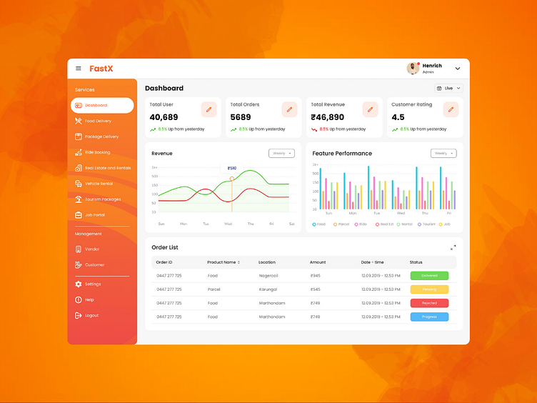
1. Summary Metrics
At the top of the dashboard, a summary section provides quick access to key metrics:
- Total Revenue: Displays the cumulative revenue generated by the platform. This metric helps administrators track financial performance at a glance.
- Pending Payments: Shows the total amount of payments that are pending. This is crucial for managing cash flow and ensuring timely payments.
- Number of Users: Indicates the total number of active users on the platform. It helps in understanding user growth and engagement.
- Average Rating: Reflects the average user rating for the services provided. This metric is essential for monitoring service quality and user satisfaction.
2. Trends and Revenue Charts
Below the summary metrics, the dashboard features interactive charts that visualize key trends:
- Revenue Trend Chart: This line or bar chart shows the revenue trend over a selected period (daily, weekly, monthly). It helps administrators identify patterns, peaks, and troughs in revenue generation.
- User Growth Chart: This chart tracks the growth in the number of users over time. It provides insights into user acquisition and retention rates.
- Service Rating Trend: A chart that shows changes in user ratings over time, helping to pinpoint periods of high satisfaction or dissatisfaction.
3. Order Management Table
The dashboard includes a detailed table view that highlights the order list. This table provides a comprehensive overview of all service requests, including:
- Order ID: A unique identifier for each order.
- User Name: The name of the user who placed the order.
- Service Requested: The specific service that was requested.
- Status: The current status of the order (e.g., pending, in-progress, completed).
- Amount: The payment amount associated with the order.
- Date: The date the order was placed.
- Actions: Options to view details, update status, or resolve issues related to the order.
Administrators can sort, filter, and search through the orders to manage them effectively. Highlighting specific orders that require attention (e.g., overdue orders, high-value orders) is also possible.
4. Notifications and Alerts
The dashboard features a notifications panel that keeps administrators informed about critical updates and alerts, such as:
- New Service Requests: Alerts for incoming service requests that need to be assigned.
- Pending Issues: Notifications about any pending issues that require immediate attention.
- Payment Reminders: Alerts for pending payments that need to be processed.
User-Centric Design
The FastX Admin Dashboard is designed with a focus on usability and accessibility:
- Intuitive Interface: The layout is clean and easy to navigate, ensuring that administrators can find and use the tools they need quickly.
- Customizable Widgets: Administrators can customize their dashboard with widgets that are most relevant to their role, improving efficiency.
- Responsive Design: The dashboard is fully responsive, ensuring a seamless experience on desktops, tablets, and mobile devices.
Impact and Benefits
The FastX Admin Dashboard significantly enhances the ability of administrators to manage services efficiently and effectively:
- Improved Decision-Making: Access to real-time data and comprehensive metrics enables data-driven decisions.
- Enhanced Oversight: Detailed views of orders and trends help administrators maintain control over operations and address issues promptly.
- Increased Efficiency: The intuitive design and powerful tools streamline administrative tasks, freeing up time for strategic activities.
Conclusion
The FastX Admin Dashboard exemplifies a well-designed, user-centric tool that empowers administrators to manage community services with ease and efficiency. By centralizing key metrics, providing insightful visualizations, and enabling detailed order management, the dashboard supports the overarching goal of bridging service gaps in small towns and villages. Continuous improvements and feedback integration will ensure that the dashboard remains a vital asset for FastX administrators.
Key Components
1. Summary Metrics
At the top of the dashboard, a summary section provides quick access to key metrics:
- Total Revenue: Displays the cumulative revenue generated by the platform. This metric helps administrators track financial performance at a glance.
- Pending Payments: Shows the total amount of payments that are pending. This is crucial for managing cash flow and ensuring timely payments.
- Number of Users: Indicates the total number of active users on the platform. It helps in understanding user growth and engagement.
- Average Rating: Reflects the average user rating for the services provided. This metric is essential for monitoring service quality and user satisfaction.
2. Trends and Revenue Charts
Below the summary metrics, the dashboard features interactive charts that visualize key trends:
- Revenue Trend Chart: This line or bar chart shows the revenue trend over a selected period (daily, weekly, monthly). It helps administrators identify patterns, peaks, and troughs in revenue generation.
- User Growth Chart: This chart tracks the growth in the number of users over time. It provides insights into user acquisition and retention rates.
- Service Rating Trend: A chart that shows changes in user ratings over time, helping to pinpoint periods of high satisfaction or dissatisfaction.
3. Order Management Table
The dashboard includes a detailed table view that highlights the order list. This table provides a comprehensive overview of all service requests, including:
- Order ID: A unique identifier for each order.
- User Name: The name of the user who placed the order.
- Service Requested: The specific service that was requested.
- Status: The current status of the order (e.g., pending, in-progress, completed).
- Amount: The payment amount associated with the order.
- Date: The date the order was placed.
- Actions: Options to view details, update status, or resolve issues related to the order.
Administrators can sort, filter, and search through the orders to manage them effectively. Highlighting specific orders that require attention (e.g., overdue orders, high-value orders) is also possible.
4. Notifications and Alerts
The dashboard features a notifications panel that keeps administrators informed about critical updates and alerts, such as:
- New Service Requests: Alerts for incoming service requests that need to be assigned.
- Pending Issues: Notifications about any pending issues that require immediate attention.
- Payment Reminders: Alerts for pending payments that need to be processed.
User-Centric Design
The FastX Admin Dashboard is designed with a focus on usability and accessibility:
- Intuitive Interface: The layout is clean and easy to navigate, ensuring that administrators can find and use the tools they need quickly.
- Customizable Widgets: Administrators can customize their dashboard with widgets that are most relevant to their role, improving efficiency.
- Responsive Design: The dashboard is fully responsive, ensuring a seamless experience on desktops, tablets, and mobile devices.
Impact and Benefits
The FastX Admin Dashboard significantly enhances the ability of administrators to manage services efficiently and effectively:
- Improved Decision-Making: Access to real-time data and comprehensive metrics enables data-driven decisions.
- Enhanced Oversight: Detailed views of orders and trends help administrators maintain control over operations and address issues promptly.
- Increased Efficiency: The intuitive design and powerful tools streamline administrative tasks, freeing up time for strategic activities.
Conclusion
The FastX Admin Dashboard exemplifies a well-designed, user-centric tool that empowers administrators to manage community services with ease and efficiency. By centralizing key metrics, providing insightful visualizations, and enabling detailed order management, the dashboard supports the overarching goal of bridging service gaps in small towns and villages. Continuous improvements and feedback integration will ensure that the dashboard remains a vital asset for FastX administrators.