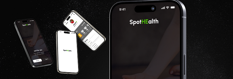
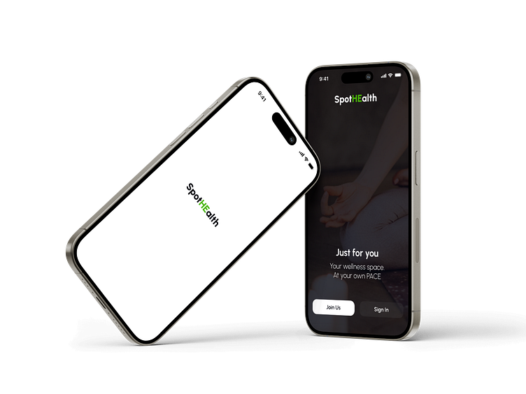
SpotHEalth

Design Overview
This fitness app focuses on delivering personalized workout plans tailored to individual goals and fitness levels. The design process was driven by my commitment to creating an intuitive and engaging user experience, ensuring that users can effortlessly navigate through their fitness journey.
What went into design?
User research
As this was a small-scale project, I conducted minimal research to understand the needs, preferences, and pain points of fitness enthusiasts. This informed my design decisions and helped me create a user-centered interface.
UI/UX Design
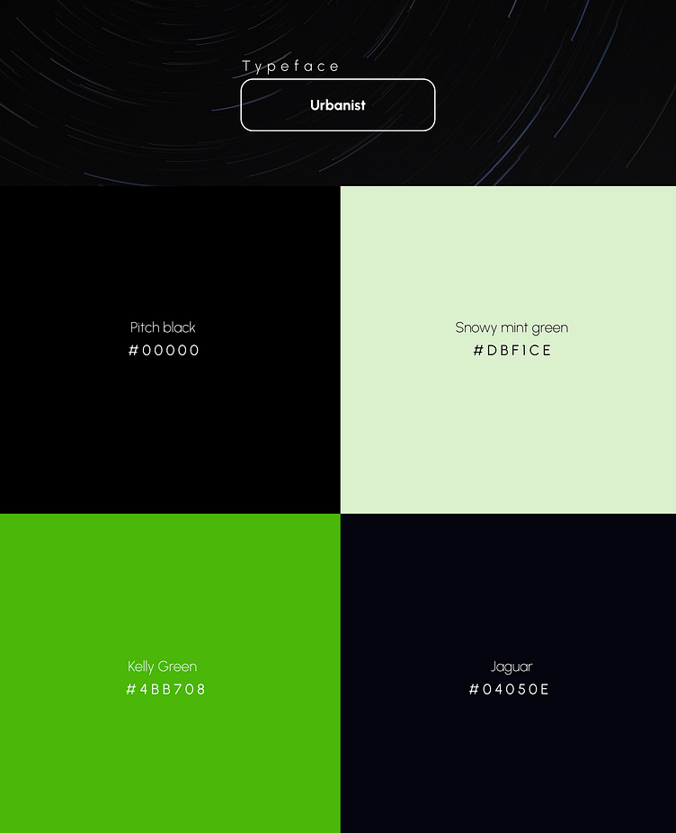
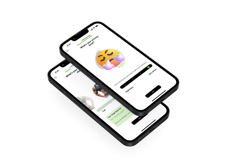
My design emphasizes a clean and modern aesthetic, using a consistent color scheme and typography to enhance readability and visual appeal. The primary colors used include pitch black, kelly green, jaguar, and snowy mint green, creating a vibrant and dynamic interface that is both visually appealing and easy to navigate.
Personalization
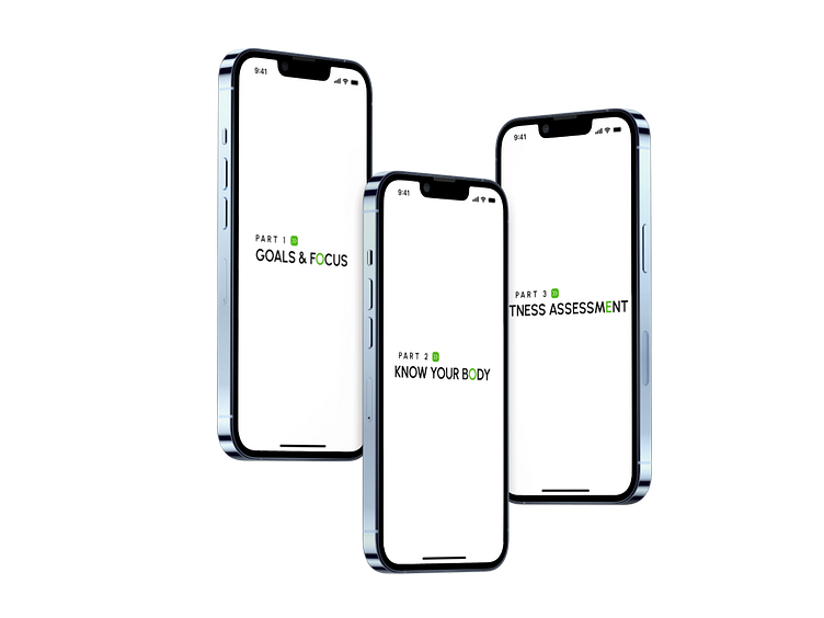
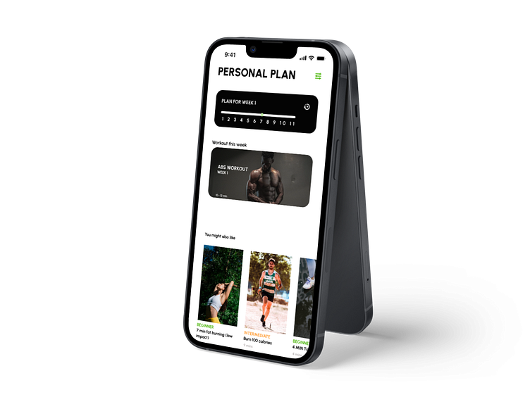
The app will aim to provide personalized workout plans based on user inputs such as fitness goals and levels. This required designing flexible and dynamic interfaces that can adapt to various user profiles.
Visual design
I incorporated motivational imagery and icons to create an inspiring atmosphere. Attention to detail in animations and transitions, combined with the selected color palette, will add to the overall smooth and engaging user experience.
'Bootcamp' assignment
This application design is part of an assignment for a bootcamp that I attended. It represents one of my first designs and showcases the skills and knowledge I gained during the course. I drew inspiration from multiple existing fitness applications to create a unique and cohesive design.