Berry & Son Brand Identity Concept


Introduction
In a market where history and craftsmanship intertwine, Berry & Sons stands out as a beacon of heritage and quality. This family-owned business, stewarded by Thomas Berry, has thrived for 80 years by offering an eclectic array of antiques, retro furniture, mirrors, and diverse curiosities that resonate with collectors and enthusiasts alike. Tasked with refreshing their brand identity, my goal was to encapsulate Berry & Sons' rich history and multifaceted nature while positioning them for continued relevance in the modern marketplace.
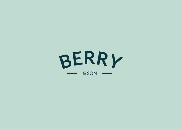
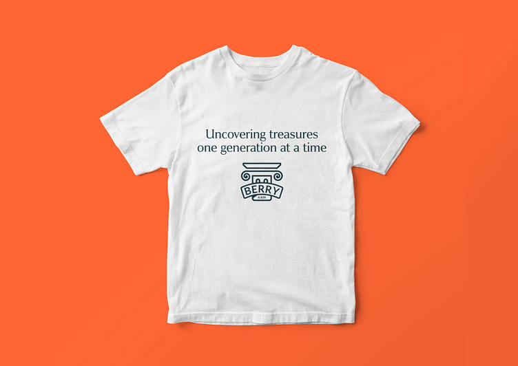
The challenge was to create a visual identity that speaks to both the legacy and the contemporary versatility of Berry & Sons. The result is a brand identity that respects the past, engages the present, and prepares for the future. The primary logo, featuring a simple oval vintage text formation, aligns with traditional values, while the vibrant blue and orange colour palette injects a fresh, modern vibe. The secondary logo incorporates a Greek pillar, symbolising the ancient world and reflecting the timeless nature of Berry & Sons' offerings.
This case study delves into the strategic thinking behind the rebranding, the design choices made, and the impact of these changes on the business's market position. Join me as we explore how Berry & Sons has revitalised its brand identity to continue its legacy of curating exceptional items with a story to tell.


Verbal Identity
At the core of Berry & Sons' verbal identity is a series of statements that not only guide my design approach but also articulate the essence of the brand to the outside world. These statements encapsulate the purpose, mission, and vision of Berry & Sons, highlighting both the functional excellence and emotional resonance of the brand.
Purpose: Berry & Sons exists to connect people with the beauty and history of the past through carefully curated antiques and collectibles. I believe every item has a story, and it’s my mission to find these stories homes where they will be appreciated and cherished.
Mission: To provide a gateway to the past, enriching customers' lives with unique and timeless pieces that tell a story. I achieve this by sourcing and preserving high-quality antiques, retro furniture, and curiosities, ensuring they continue to bring joy and character to homes and collections.
Vision: To be recognised as the premier destination for antique enthusiasts and collectors, known for my commitment to quality, authenticity, and unmatched customer experience.
These elements come together in an elevator pitch that positions Berry & Sons not just as a shop, but as a portal to the past, where every purchase is an investment in history and heritage.

Logo
The primary logo for Berry & Sons is designed to embody the rich heritage and timeless elegance that characterise the brand. It features a simple, oval vintage text formation that gracefully encapsulates the brand name, providing a classic and sophisticated look. This design choice reflects the brand's longstanding history and commitment to tradition, resonating with both the age and the quality of the antiques offered.
Complementing the primary logo, the secondary logo incorporates an image of a Greek pillar, a potent symbol of the ancient world and enduring strength. This choice is deliberate, linking the pieces sold by Berry & Sons to the longevity and cultural significance of ancient artefacts. The use of a Greek pillar not only adds a layer of depth to the brand's visual identity but also serves as a visual metaphor for the structural and historical solidity of the items in their collection.
The colour palette of blue and orange tones further enhances the visual identity, offering a blend of reliability, warmth, and creativity. Blue evokes a sense of trust and dependability, mirroring the reliability of Berry & Sons as a curator of fine antiques, while orange adds a touch of enthusiasm and passion, reflecting the vibrant life stories behind each curated piece. Together, these logos and colours forge a strong brand identity that speaks of quality, trust, and historical depth.