GARYE | Logo & Brand Identity

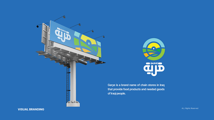
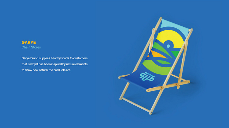


GARYE is a chain store that provides groceries and essential items in Iraq. The name "Gariye" means "settlement" or "village" in Arabic. As the center of social interaction, Gariye represents aspects of people's lives and their connection to the environment.
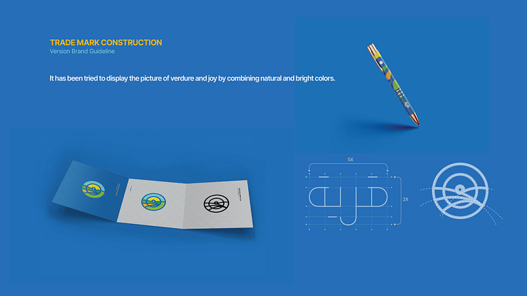
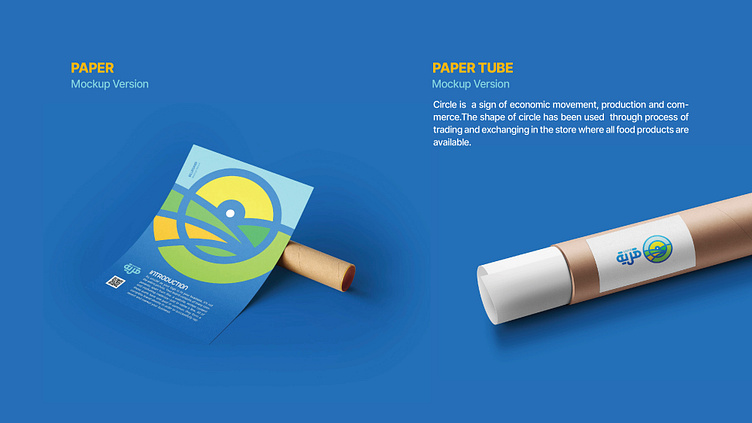
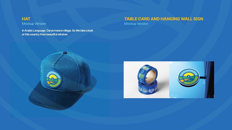
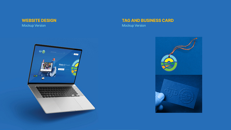
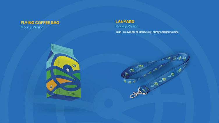
In the design of the GARYE logo, an attempt is to open a window to the beauty and life in the village. The geometric shape of the circle is a symbol of centrality, focus, and infinity. Inside the circle, a representation of the greenery and vitality of the village is depicted with bright colors, indicating the continuous flow of life in the store.
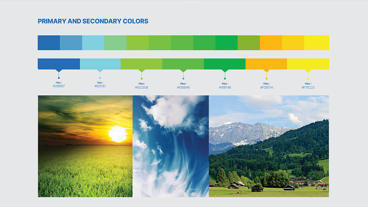
The logo colors include green, blue, yellow, and orange. Green symbolizes the color of nature. Blue represents the boundless sky. Yellow symbolizes the sun, and orange is a cheerful color, designed symbolically within the circular frame to depict the vibrancy of the village and evoke the diversity of products and goods in the store.
Chain market, Iraq
• Logo Tasarım ve Görsel Kimlik
• Logo Design & Brand Identity