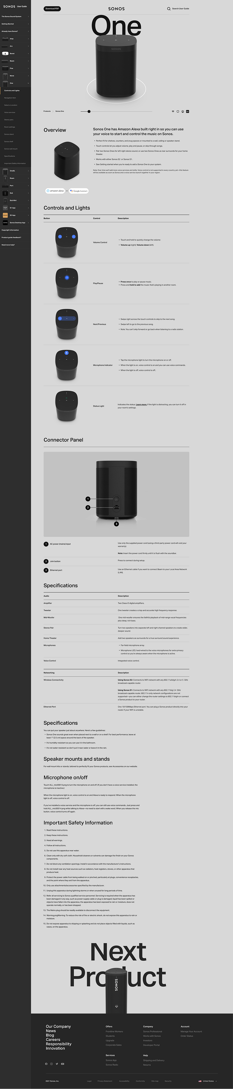
Sonos User Guide


This was a project done at Sonos in 2022 - a collaboration with the Content Services team. The goal was to streamline the way online user guides are produced and published. We needed structured content to improve consistency, reduce localization costs, and greatly improve internal efficiencies. The main goals were to implement aesthetic updates to make navigating, searching, and discovering content a better experience for Sonos customers.
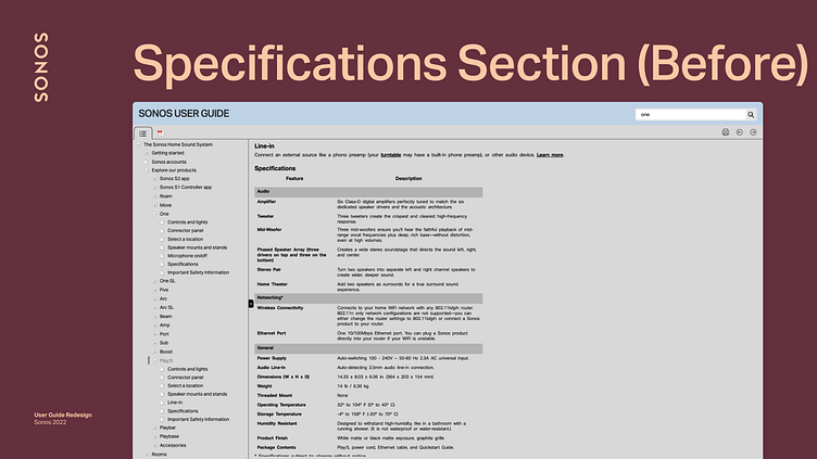
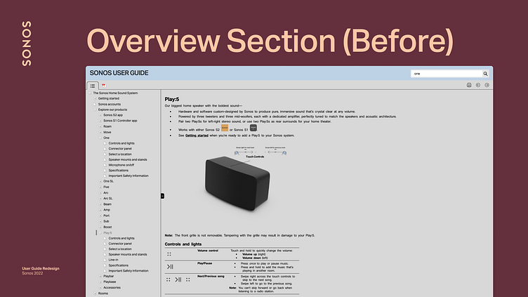
Before

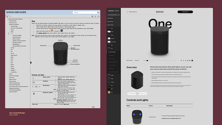
Before the redesign, the guide felt very utilitarian. It was managed in an older content management system, and visually it felt more like a printed tech spec sheet than something a user would feel compelled to want to sit and read.
The goals for the redesign were threefold:
Visual
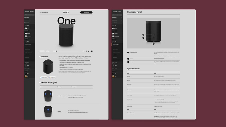
Update the aesthetic presentation that will not only make Sonos products look premium, but also make it easier for users to understand key concepts.
Content
Streamline the way we produce and publish, making it easier to create and maintain content. We had a goal of moving towards structured content to allow reuse of assets and content across modules and pages.
Experiential
Enhancements to the user guide to make navigating, searching, and discovering content a better experience.
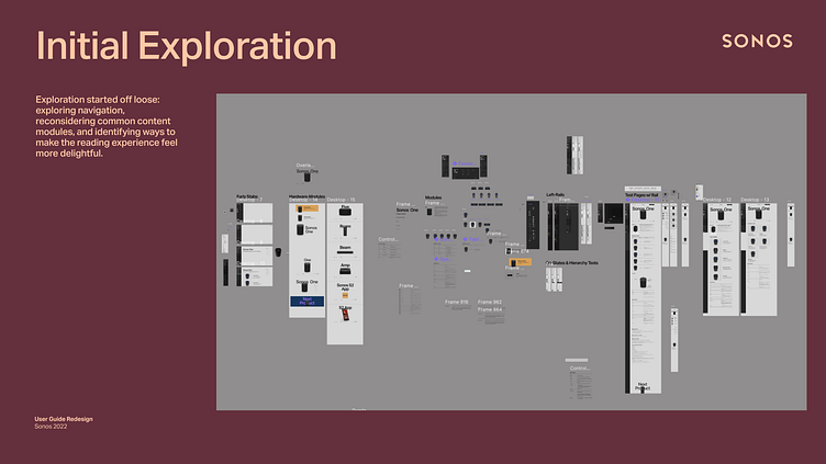
Initial Exploration
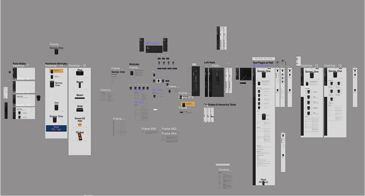
To kick things off, I started off by looking at the original user guide and aiming to identify how to break down the most common elements into repeatable components. I was also looking into how to restructure the navigation into a more visually appealing siderail.

Initial Draft
Initially I was aiming to make what looked like a solid foundation for a page template, and still determining what the navigation structure should be. At first I imagined a much more simplified navigation structure showing products on a home page that would lead to individual articles. This ultimately didn't stick because we had a strong desire to have anchor links and easier access to other products from a given page.
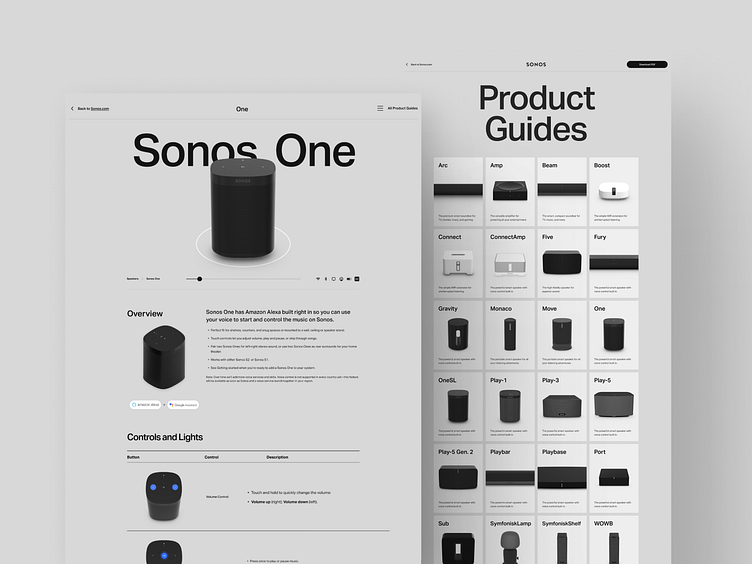

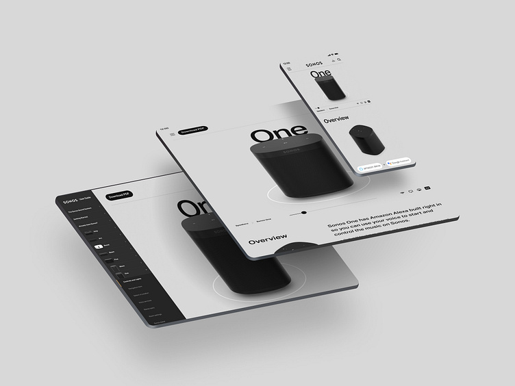
Final Design
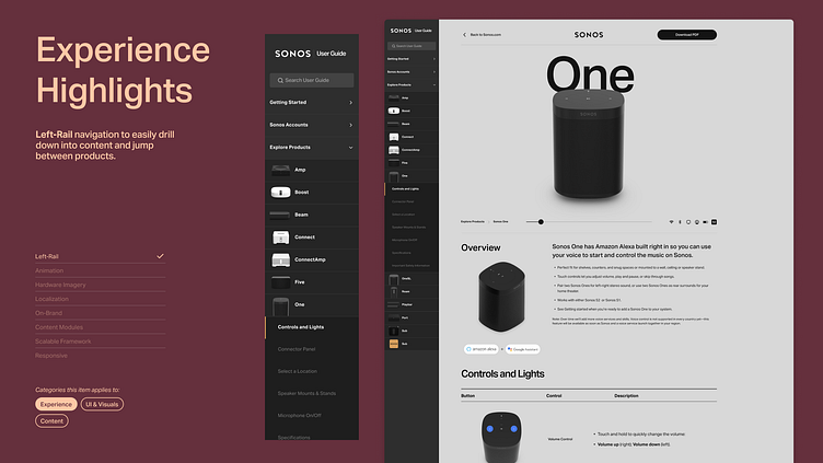
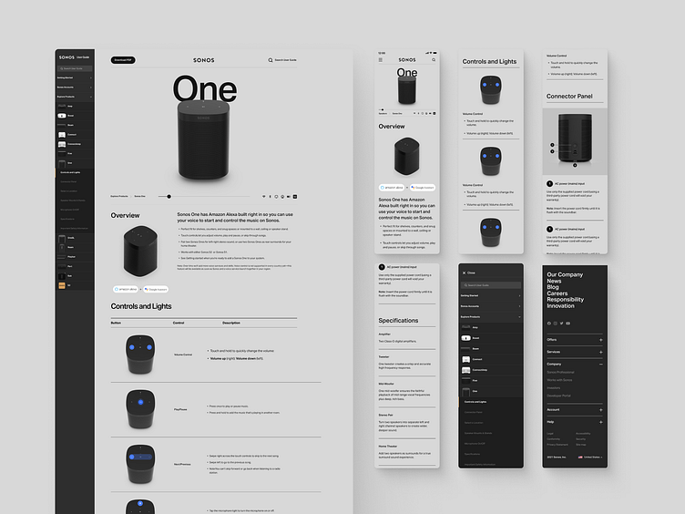
New Navigation
Left-Rail navigation to easily drill down into content and jump between products.
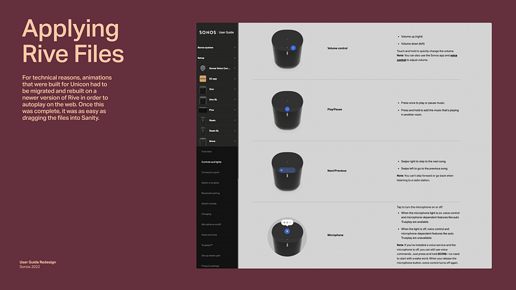
Animation
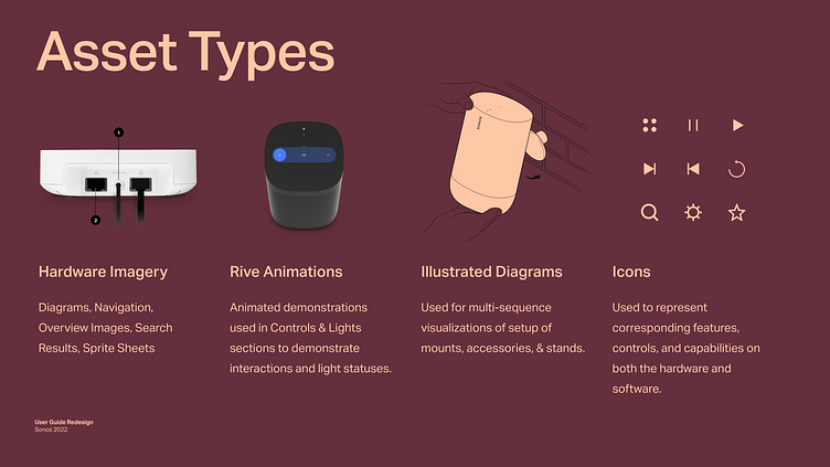
We wanted animation or videos to help demonstrate product usage and demonstrate different button presses and status light behavior. Hardware onboarding animations that I had already built in Rive for the Sonos app and were repurposed for the online user guide.
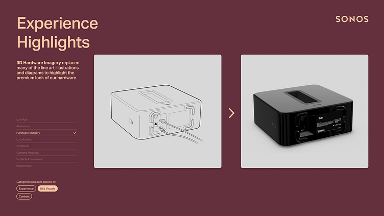
3D over 2D
3D Hardware Imagery replaced many of the line art illustrations and diagrams to highlight the premium look of our hardware.
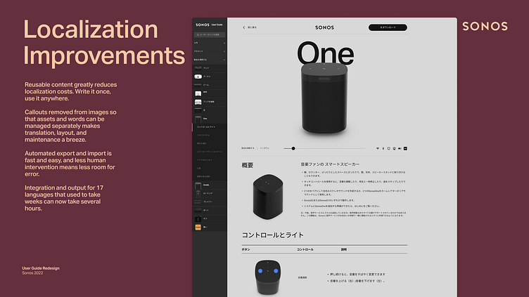
Localization
Localization needed to be decoupled from images. Previously, localized copy was part of images, which meant hundreds of images per language had to be managed. A new, numbered callout system allows for significantly greater ease of management of foreign language content.
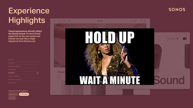
On-Brand
On-Brand in terms of of visual appearance. Product Guides are available from Product Detail Pages and should not look like a major departure from the Sonos website and are accomplishing a different job than our ecommerce site. The visual design needed to remain true to Sonos without taking the .com’s design verbatim.
Scalable Content
Content Modules built as reusable components that can have copy entered once and updated globally throughout the user guides.
Portfolio Friendly
A scalable framework that works across the entire entire product portfolio.
Responsive
A responsive experience that translates across all device sizes.
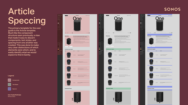
Design systemization
Component creation, page building
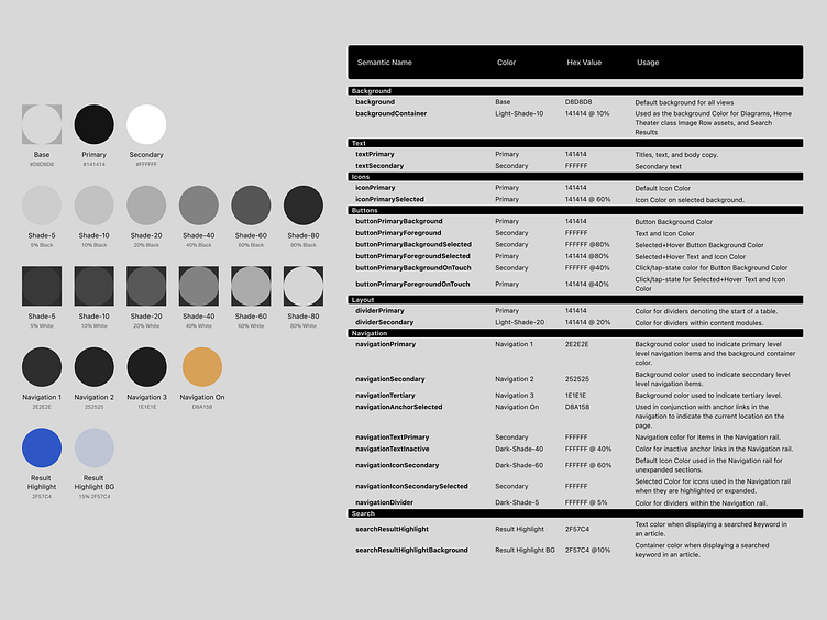
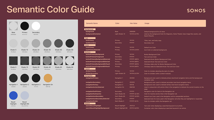
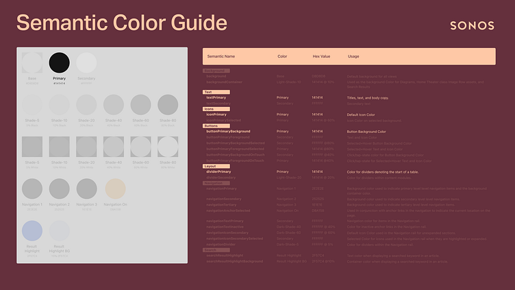
The guide used a semantic color system to target color application to specific usages of color in the website.

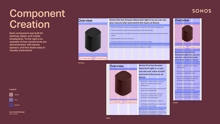
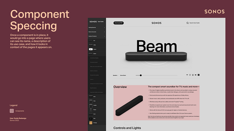
Various component examples used within the guide.

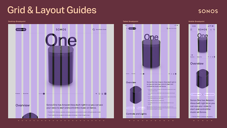
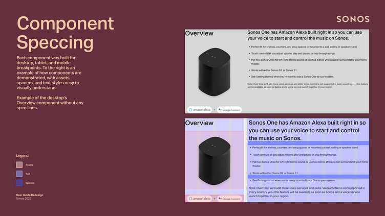
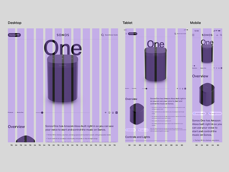
Each component was built for desktop, tablet, and mobile breakpoints. Above is an example of how components are demonstrated, with assets, spacers, and text styles easy to visually understand.

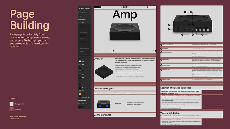
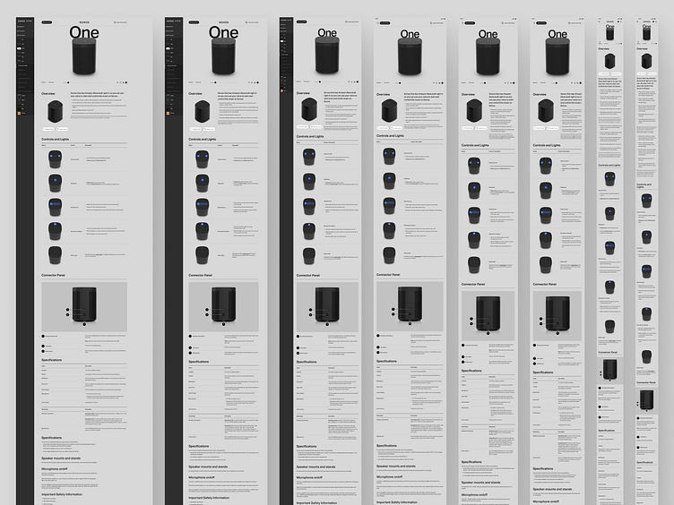
Each page is built solely from documented components, styles, and assets.

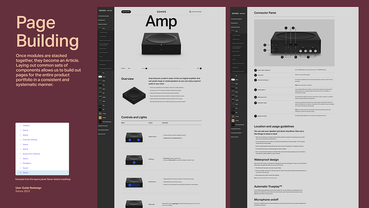
Once modules are stacked together, they become an Article. Laying out common sets of components allows us to build out pages for the entire product portfolio in a consistent and systematic manner.
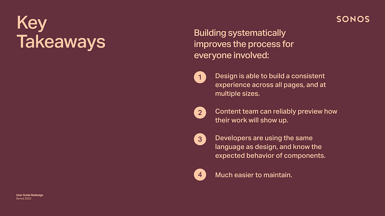
Building systematically improves the process for everyone involved:
Design is able to build a consistent experience across all pages, and at multiple sizes.
Content team can reliably preview how their work will show up.
Developers are using the same language as design, and know the expected behavior of components.
Much easier to maintain.
Premium Touches
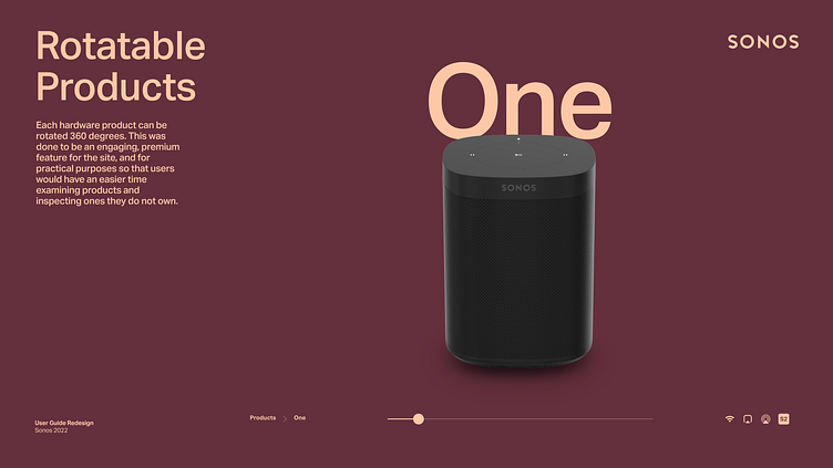
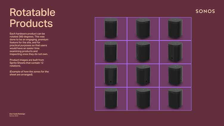
Each hardware product can be rotated 360 degrees. This was done to be an engaging, premium feature for the site, and for practical purposes so that users would have an easier time examining products and inspecting ones they do not own. Product images are built from Sprite Sheets that contain 12 rotations. (Example of how the zones for the sheet are arranged below).

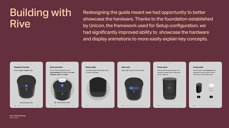
Animation
Animations that were built in Rive for in-app product tours were able to be recontextualized for use in the guide. Examples above are from the Move product tour which could then be used on the Move's User Guide to demonstrate swipe actions, voice assistant capability, and low power status LED indication.
Responsive Building
The site was built with full support for large desktops all the way down to mobile.
Works for the whole portfolio!
The system we built for the guide works for every product in our hardware portfolio, and also extends to pages for the mobile app and desktop controllers.

Case Study Presentation (Selected slides)