Syncare - Visual Identity Design

Syncare is a consulting company specializing in Clinical Engineering and Hospital Infrastructure Engineering. Its team is comprised of engineers, economists, and administrators, with over 20 years of experience in consulting and engineering projects. Its differentiator lies in its knowledge and reach within financial institutions, development agencies, and investment entities in the healthcare sector, contributing to the feasibility of projects and value generation for stakeholders.
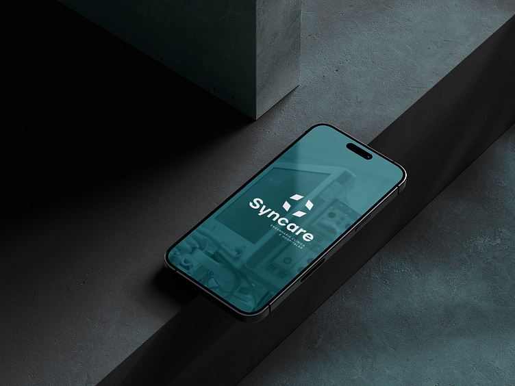
The concept for creating the brand was conceived from the fusion of the words "Sync" and "Care", representing synchronization and care, respectively. The symbol with four points suggests synchrony in a circular format, evoking the idea of care, with an abstract element in the center reminiscent of the medical-hospital symbol. The typography was chosen to convey seriousness and a unique style. The color palette, based on shades of green, reflects the healthcare domain, associated with tranquility, trust, and organization.
See the full project here >> Syncare - Engenharia Clínica e Hospitalar :: Behance