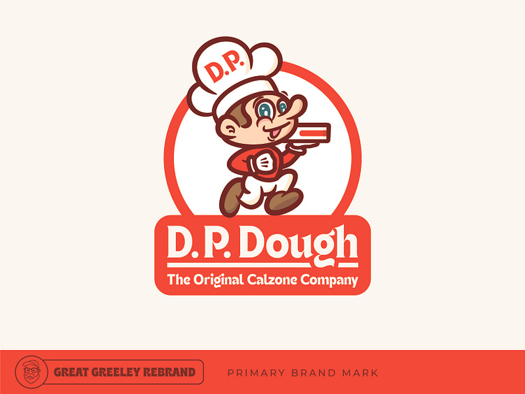
D.P. Dough - The Great Greeley Rebrand

I started a series on Instagram recently called The Greeley Rebrand. I've been picking local businesses to give my own take on their brand and how they show up visually in the world!
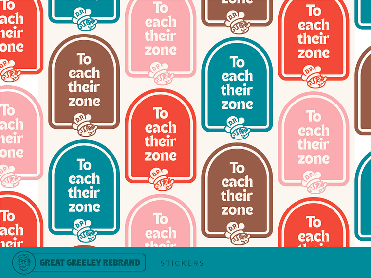
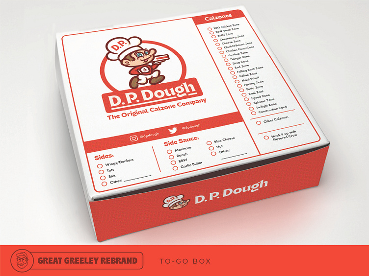
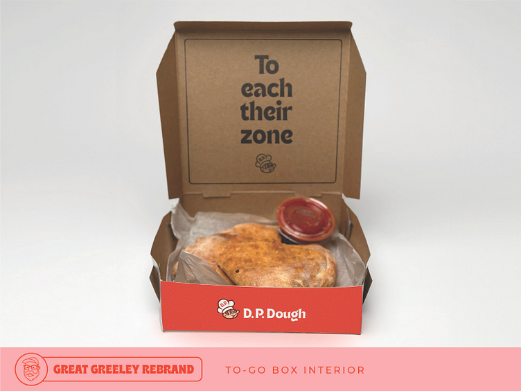
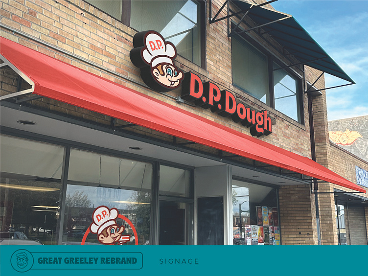
D.P. Dough was opened in 1987, so knowing nothing more than what I could read about on their website, the direction I took with this brand refresh was to push a look that could have come from a 1980s cartoon (this one is inspired by The Smurfs, because their existing chef character sort of reminds me of Gorgamel). Using a modernized version of ITC Gothic Serif, the type also speaks to the era. This take celebrates D.P. Dough's long standing place in restaurant culture with a mark that looks classic and timeless.here...