Thread's Shirt

Project overview
The product:
Thread's Shirt is an affordable clothing store designed for individuals aged 19–30, primarily catering to college students and early-career professionals. The store aims to provide an enjoyable, quick, and hassle-free shopping experience for a diverse range of users.
Project duration:
January 2024 to February 2024.
The problem:
Online shopping websites with cluttered designs, inefficient product browsing systems, and confusing checkout processes.
The goal:
Create a user-friendly T-shirt website with easily navigable features and a streamlined checkout process for swift transactions.
My role:
UX designer leading the Thread's Shirt website design.
Responsibilities:
Conducting interviews, creating paper and digital wireframes, developing low- and high-fidelity prototypes, performing usability studies, ensuring accessibility considerations, refining designs through iteration, and incorporating responsive design principles.
User research:
I conducted user interviews and turned the insights gathered into empathy maps to gain a deeper understanding of the target user and their requirements. My findings revealed that a significant number of users perceive online shopping as a pleasurable and calming diversion from their academic or professional responsibilities. Unfortunately, numerous shopping websites prove to be overwhelming and confusing to navigate, leading to frustration among these users. What should be a delightful and stress-relieving experience turns into a challenging one, contradicting the intended purpose of relaxation.
Pain points:
Navigation: The designs of shopping websites are often busy, which results in confusing navigation.
Interaction: The small buttons on shopping websites make item selection difficult, which often causes users to make errors.
Experience: Browsing on online shopping platforms lacks an immersive and captivating experience.
Problem statement:
Elsa, a college student with a busy schedule, seeks user-friendly website navigation and efficient search filters to ensure a stress-free online shopping experience.
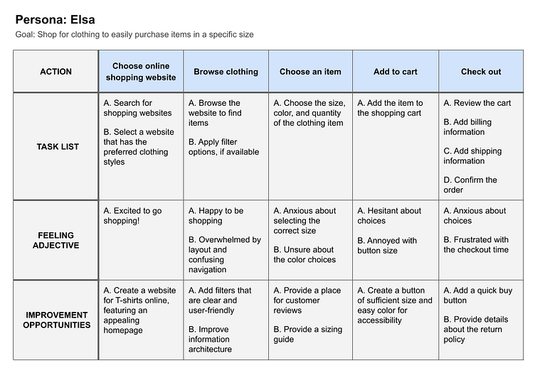
Persona:

User journey map:
I created a user journey map illustrating Elsa's interaction with the website, aiming to pinpoint potential pain points and improvement opportunities.

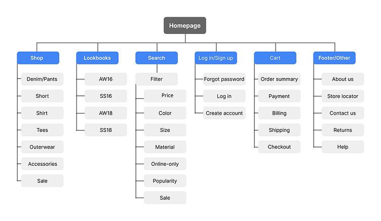
Sitemap:
Users faced difficulty navigating the website, so I used that to address this issue by developing a sitemap. My goal was to enhance the overall website navigation by making strategic decisions in information architecture. The chosen structure was crafted for simplicity and ease of use.
User Flow:

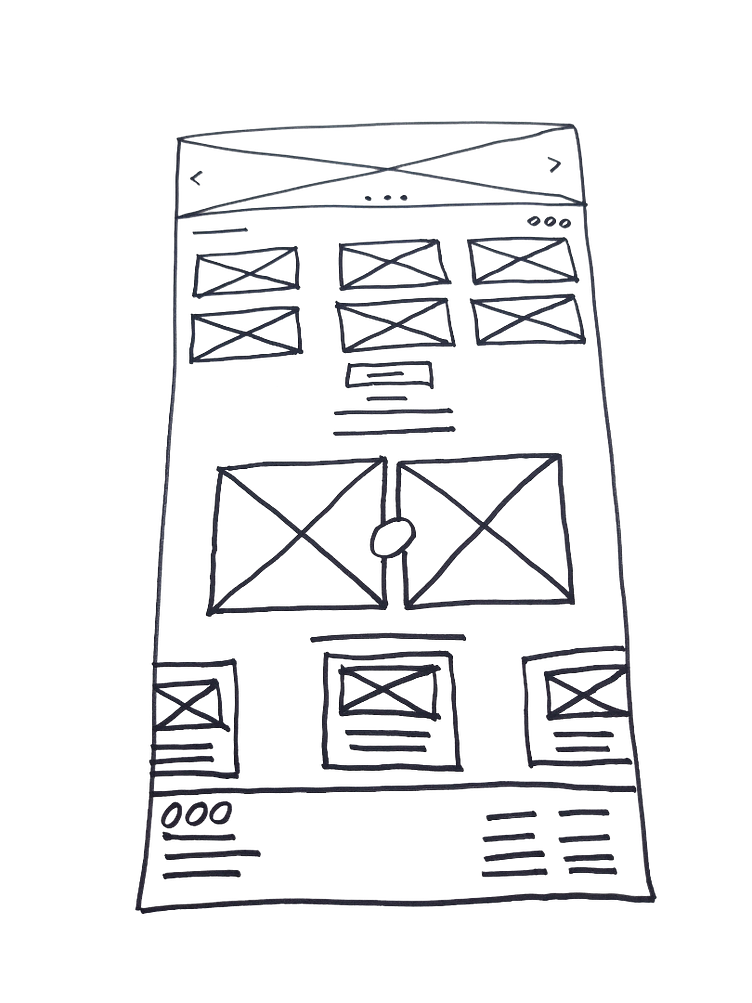
Paper wireframes:
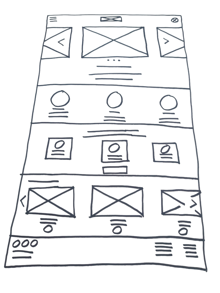
Next, I sketched out paper wireframes for every screen in my application,keeping the user pain points related to navigation, browsing, and the checkout process. The variations of paper wireframes for the home screen on the right specifically target the enhancement of the user's browsing experience.
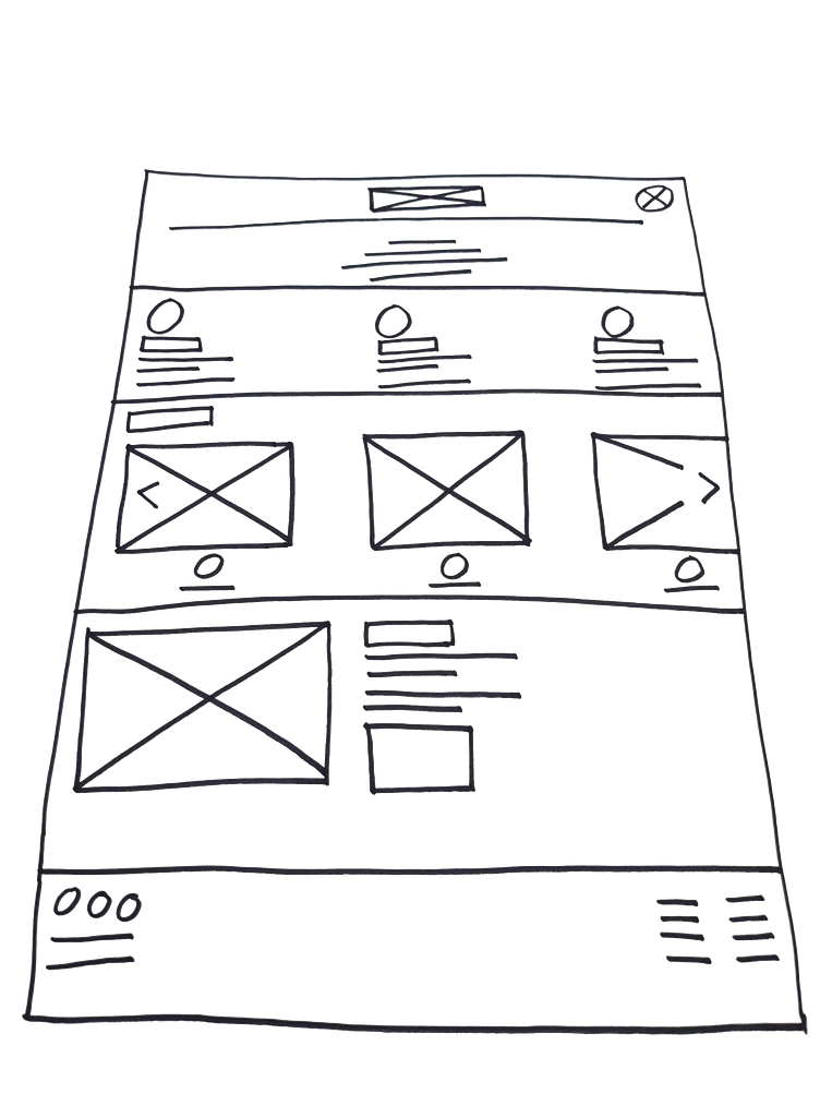
Paper wireframe screen size variations:
Because Thread's Shirt customers use various devices to access the site, I initiated the development of designs for additional screen sizes to ensure complete responsiveness of the website.

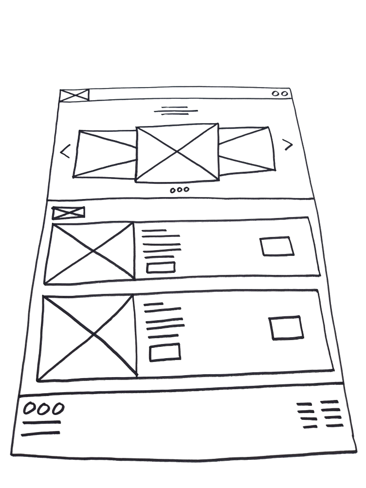
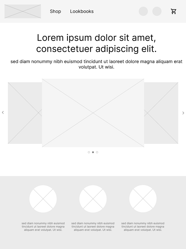
Digital wireframes:
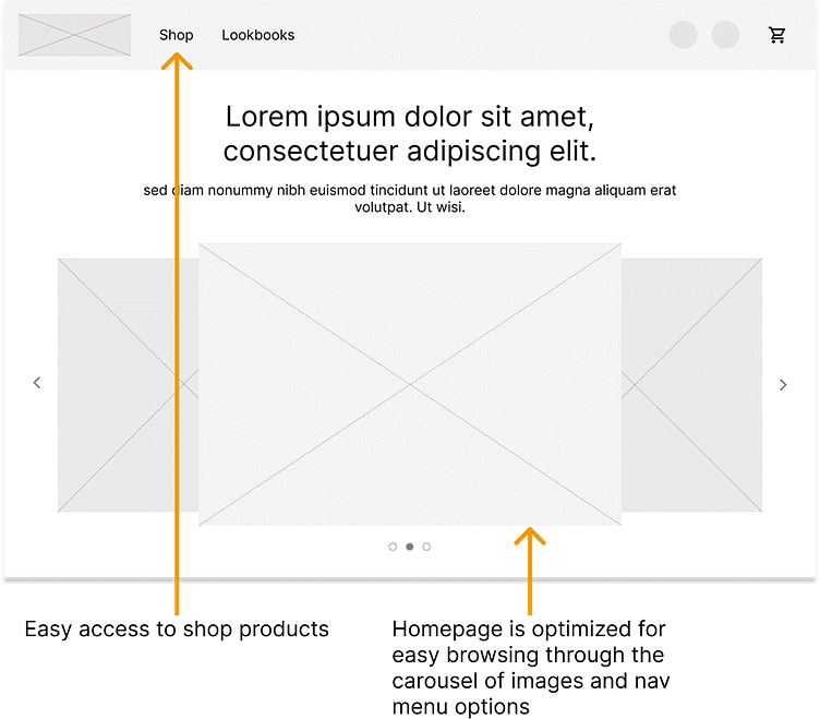
Transitioning from paper wireframes to digital ones made it easy to understand how the redesign could effectively tackle user pain points and enhance the overall user experience.
A crucial aspect of my approach involved prioritizing the placement of functional buttons and visual elements on the homepage.
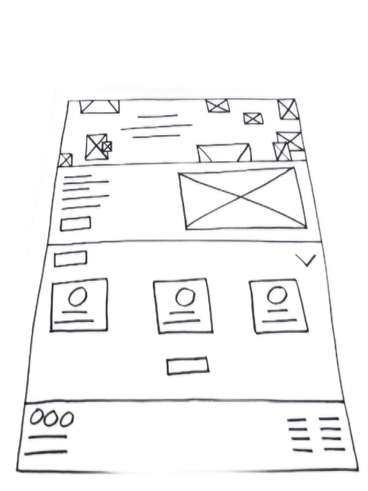
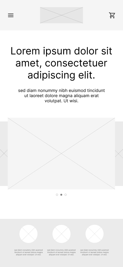
Digital wireframe screen size variation(s):
Low-fidelity prototype:
To create a low-fidelity prototype, I connected all of the screens involved in the primary user flow of adding an item to the cart and checking out.
At this point, I had received feedback on my designs from members of my team about things like placement of buttons and page organization. I made sure to listen to their feedback, and I implemented several suggestions in places that addressed user pain points.

Usability study:
These were the main findings uncovered by the usability study:
Cart: Once reaching the checkout screen, users didn't have the capability to modify the quantity of items in their cart.
Checkout: Users weren’t able to easily copy the shipping address details to the billing information field.
Account: During the checkout process, there wasn’t a clear way for users to log in to their account to pre-fill previous billing and shipping info.
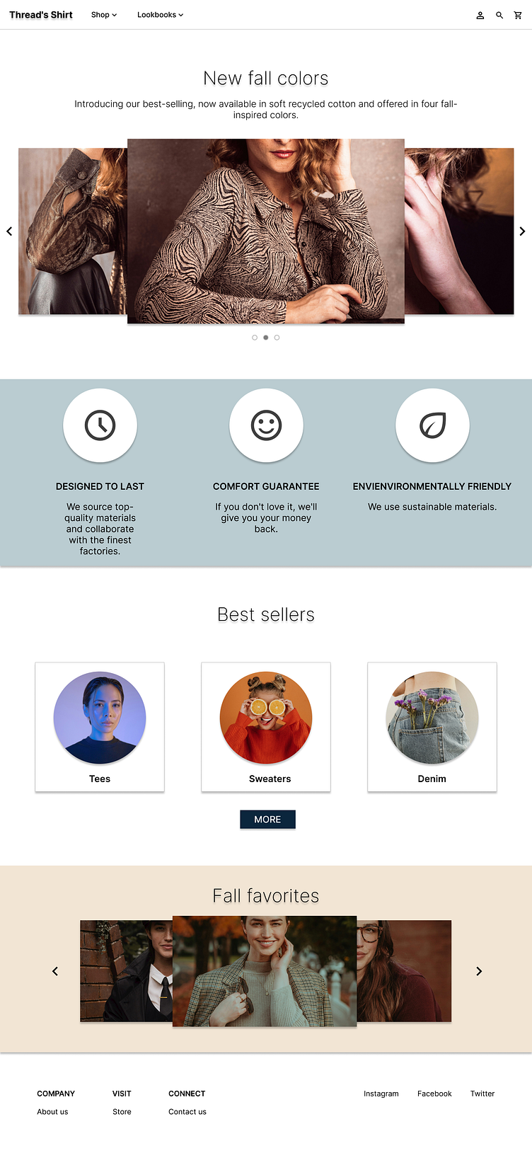
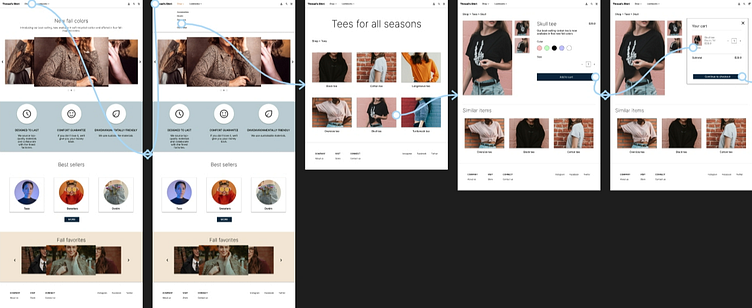
Mockups:
Based on findings from the usability study, I implemented modifications to enhance the checkout flow of the website. Among these changes was the incorporation of a straightforward "+" or "-"" option, enabling users to easily adjust the quantity of items in their cart. This adjustment grants users greater flexibility in editing their carts without the need to navigate through a cumbersome process to add or remove items.

Original screen size:
Screen size variations:
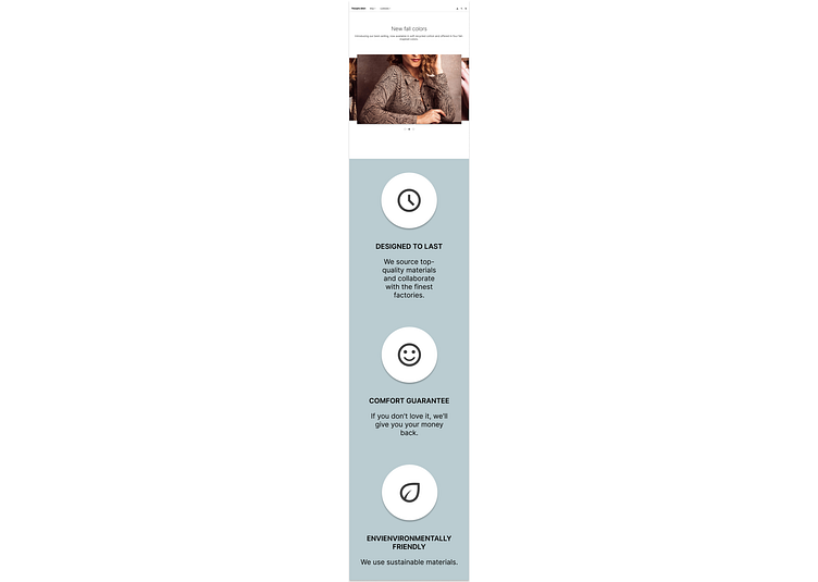
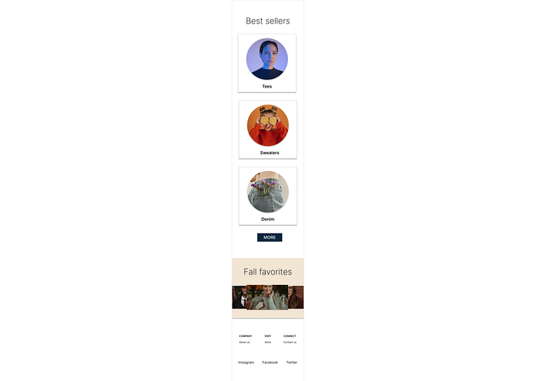
I included considerations for additional screen sizes for various screen dimensions in my mockups, based on insights from my initial wireframes. Recognizing that users engage in shopping activities across diverse devices, I prioritized enhancing the browsing experience to ensure optimal performance on a spectrum of sizes, including mobile and tablet, for a seamlessly smooth user experience.
High-fidelity prototype:
The high-fidelity prototype follows the user flow established in the low-fidelity prototype. It incorporated design modifications identified during the usability study, along with several additional changes recommended by the users.
View the thread's shirt high-fidelity prototype
Accessibility:
I use different text sizes in my headings to establish a clear visual hierarchy.
I use landmarks to assist users in navigating the website, ensuring accessibility for those who depend on assistive technologies.
I use alt text on every page of the website to ensure seamless accessibility for screen readers.
Takeaways:
Impact: Our target users, whom we aimed to reach, shared that the design was intuitive, expressed that the design was easy to navigate, became more captivating with the inclusion of images, and exhibited a distinct visual hierarchy.
What I learned: I learned that a slight alteration in design can significantly influence the user experience. The key lesson for me is to consistently prioritize the genuine needs of the user when generating design concepts and solutions.
Next steps:
Perform additional usability testing for the recently launched website.
Identify any further areas requiring attention and brainstorm innovative features.
Let’s connect!
Thank you for reviewing my work on the Thread's Shirt!
If you’d like to see more, or would like to get in touch, my contact information is provided below:
Email: design@alfianux.com
Website: alfianux.com