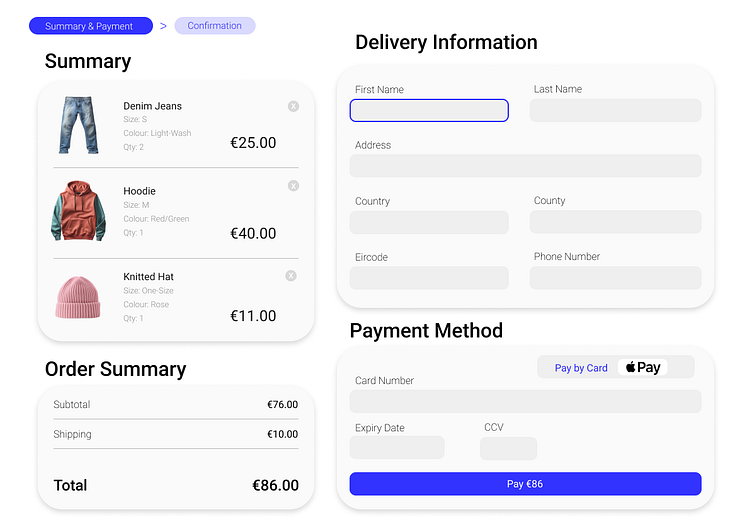
Collect UI #2 Challenge - Checkout

Checkout 🛒
I decided on a minimalist and intuitive design, using white space effectively to avoid clutter. I also used blue accents to highlight important actions and sections, guiding the user through the checkout process effortlessly and without distraction.