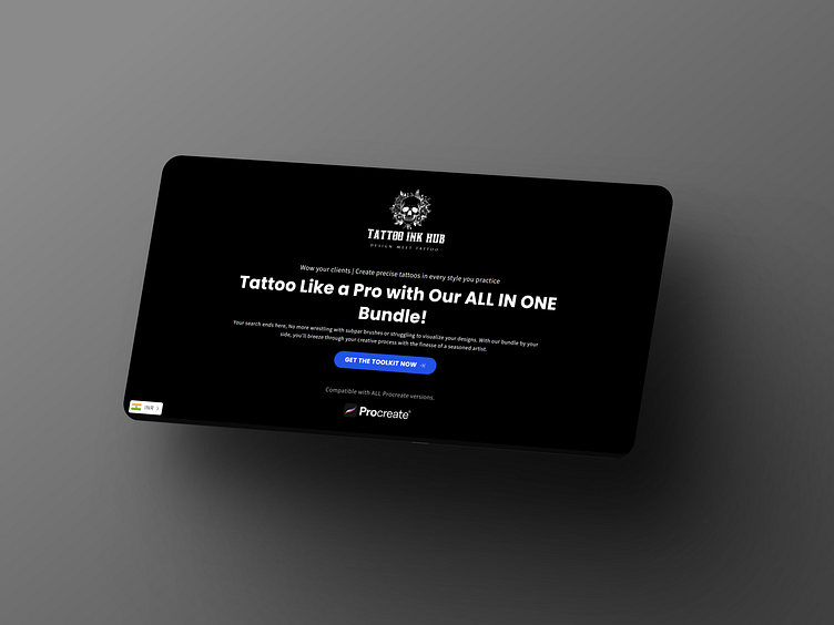
Tattoo Ink Hub

Mission:
To craft a landing page based on provided assets. For a tattoo ink repository, keeping the conversion rate in mind.

Solution:
Simple, minimal one-page design based on client preferences, using custom icons and creative copywriting
to show the product and its benefits.

Typography & Colors:
In website design, typography and colors play crucial roles
in conveying the brand identity, enhancing readability, and
creating visual appeal. Here's how typography and colors
Affected the design process of this landing page

Visual Cake

Objective:
The primary objective is to design a single-page landing site that effectively showcases the tattoo ink repository, emphasizing its unique selling points and encouraging visitors to take action, such as making a purchase or signing up for updates.
Approach:
We approached the project with a focus on simplicity, clarity, and visual appeal, aligning with the client's preferences for a minimalistic design. Leveraging custom icons and creative copywriting, we aimed to convey the essence of the product and its benefits concisely.

Design Process:
Understanding Client Preferences: We conducted thorough discussions with the client to grasp their vision, target audience, and key messaging. Their preference for a simple, clean design guided our approach throughout the design process.
Wireframing:
We began by sketching wireframes to outline the layout and structure of the landing page. This step helped us visualize the hierarchy of content and ensure a seamless user experience.
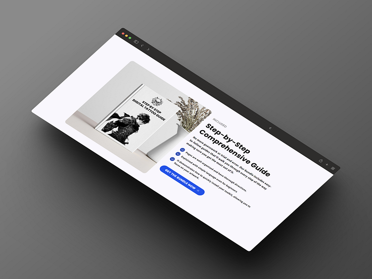
Visual Design Iterations:
By incorporating the client's brand colors and typography preferences, we experimented with various design elements to achieve a visually appealing composition with high color contrast. We aimed to strike a balance between aesthetics and functionality, keeping conversion optimization in mind.
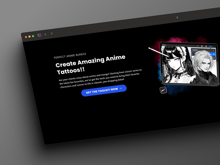
Custom Icons and Imagery:
To enhance the visual appeal and communicate the product's features effectively, we created custom icons representing different types of tattoo ink and their respective qualities. These icons served as visual cues, aiding in the quick understanding of the product offerings.
Creative Copywriting:
Writing compelling copy was essential to engage visitors and prompt them to take action. We focused on clear, concise messaging that highlighted the unique selling points of the tattoo ink repository, such as superior quality, vibrant colors, and versatility.
Responsive Design:
Recognizing the importance of mobile responsiveness in today's digital landscape, we ensured that the landing page was optimized for seamless viewing across various devices, including smartphones and tablets.
Outcome:
The final landing page design successfully encapsulates the essence of the tattoo ink repository while prioritizing conversion optimization. Through a combination of custom icons, creative copywriting, and minimalist aesthetics, we have created a visually engaging platform that effectively communicates the product's value proposition to potential customers.