Revamp Traveloka Setting Page


Hello, Dribbblers 🙌
Take a look at our fresh design of Setting Page Traveloka App.
This redesign of UI , I make it rounded to make it looks fun and friendly :)
Overview
This is my exploration UI/UX Design for setting page of travel app. I choose Traveloka for this project! I found that so many section there and some thing that shouldn't be at Setting Page.
First step:
Understanding every information in Setting Page at Traveloka
Benchmarking to the other similar App (Tiket.com, Airbnb, Agoda, Trip)
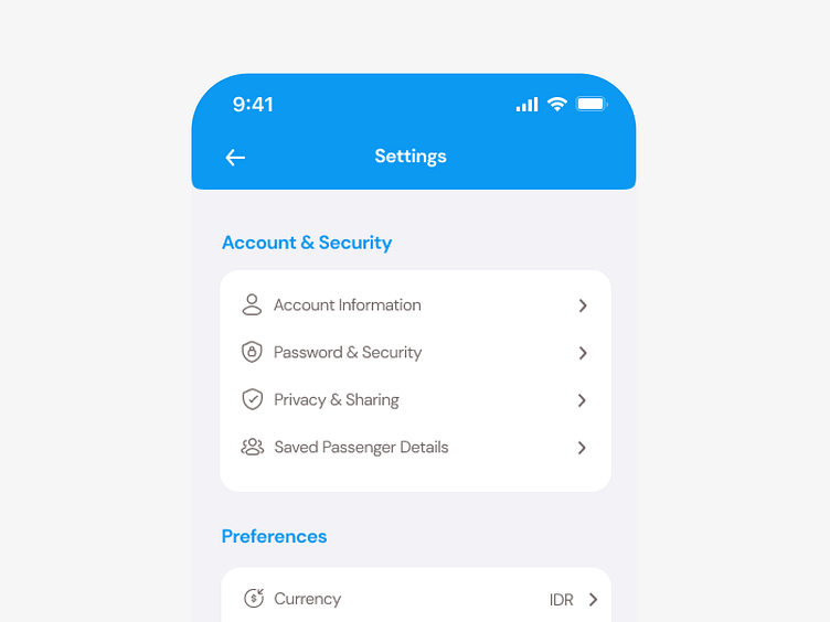
For this section, I fixing some icons and copywriting. And then, I put "Saved Passenger Details" into this section (before in the Notification Section, this is no relevant)
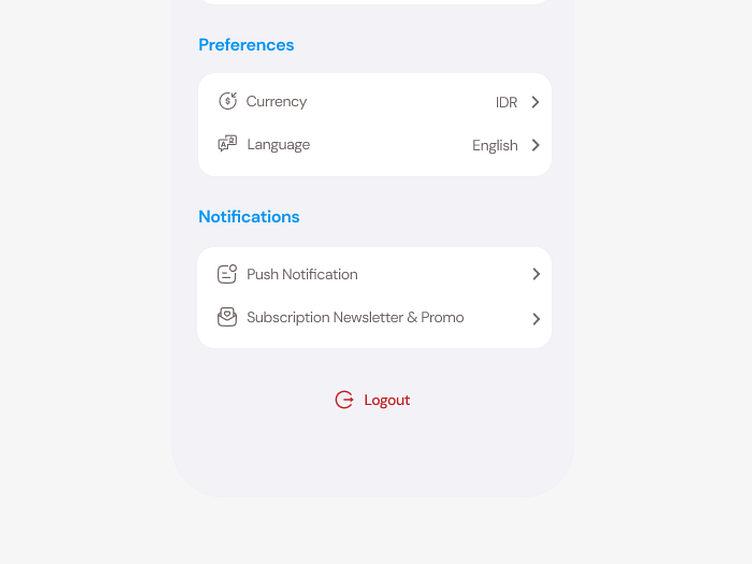
For the next section, I take out "Country" menu because I think this can just be included in the currency menu (every Country have only 1 currency) -> So, users don't make many step to input.
Beside that, also I fixing some icons and copywriting too.
At the end, I put "Logout" in the center and change the color of text and adding icon (because it should provide a warning effect for the user)