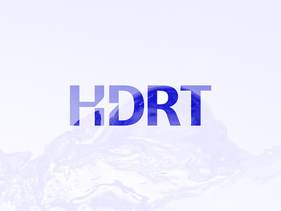
HDRT - Logo Design ⚡

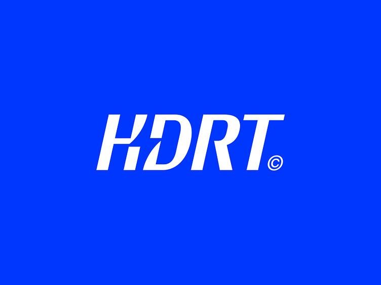
HDRT - Logo Design (refined)
Versatile hydration for strength and endurance.
Logo concept for a hydration supplement called HDRT, which is short for Hydrate. After working on this project for some time, we decided to fine-tune all the key elements the client wanted to see back in this brand (word)mark.
Italic letter flow to capture movement
The custom and luxurious feel of the letters
Spark for activation in negative space
At this point, I'm rather happy with where this is all going. The only point I'm still not 100% sure of is the fact it may read as the letter K and not H as it should be. What do you think? Currently, I am still open to hearing your points of feedback.
Thanks all! And feel free to hit that 💙 to show your support.
Do you need a Logo design or a Visual identity? 🚀
Feel free to reach out via Dribbble DM or E-mail:
👉 info@jeroenvaneerden.nl / Jeroen.design
💼 Connect with me on LinkedIn / Read my Client Recommendations
🎬 Check my YouTube for Logo Tutorials / Learn Logo Design
🔗 Follow me on Instagram / See BTS and New Content
💬 Tweet with me