I & C Drop Logo

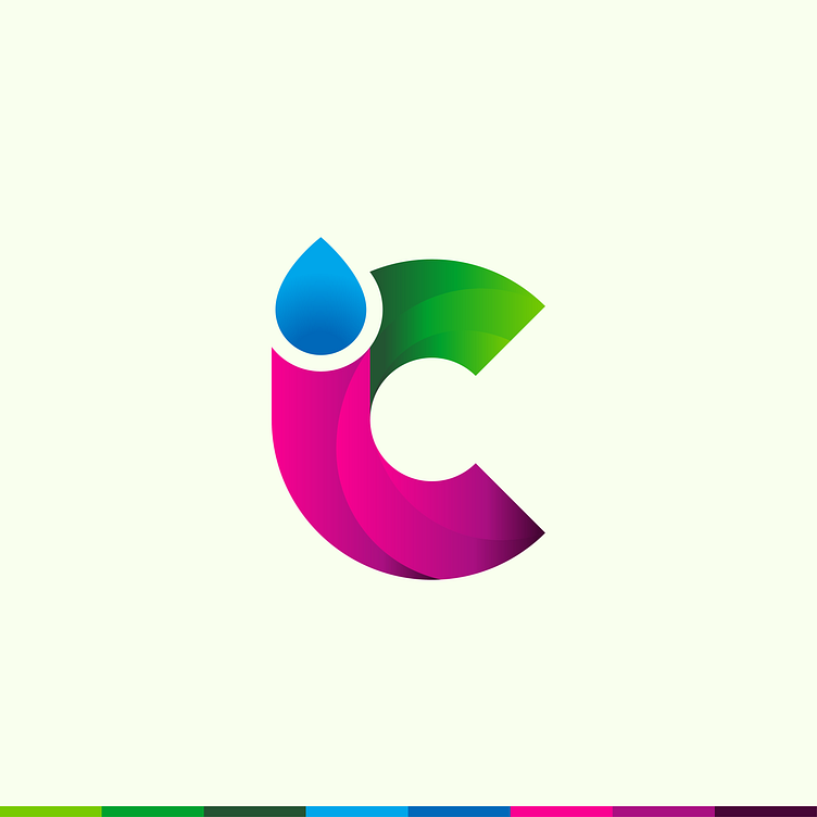
This logo was another option for a client who has an infusion medical company.
The business name has the initials "i" and "c," and I was trying to think of a creative way to blend these letters together while still integrating the drop for the infusion side of things. I wanted to try a bolder color palette to offer the client a variety that was different from the traditional medical blue tones.
The gradients add a dynamic shape that leads the eye through, aluding to the liquid of the transfusions flowing to provide health benefits.
Please see my other concepts Drop in a Diamond - Infusion Drip Gradient Logo and Water Drop Heart Logo for Medical Health Infusion Treatments
Would you like to work with me? If so, please contact DC&Co, the agency I work for, to discuss your next project.