Water Drop Illustration

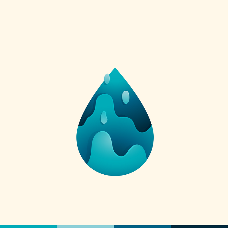
Inspired by Yoga Perdana's work I wanted to test my skills to make a smooth, gradient, layered illustration. I like that the water appears to be "falling up" much like a lava lap.
This was originally created to be a logo for an infusion company. I wanted to represent the liquid of the transfusions in an interesting way. However, this wasn't working out to be a logo, but I wanted to complete the illustration regardless.
It was a fun challenge working on maintaining a strong contrast with the monotone color palette.
I think this concept could be used as a brand element, with the waves, drops, and smooth colors.
Would you like to work with me? If so, please contact DC&Co, the agency I work for, to discuss your next project.